Monday, April 26, 2021

summer berry fields, a finish

this very summery feeling quilt began with a navy blue strawberry fabric, and then a few more strawberries from my collection, followed by some blues to coordinate with that original fabric, some low volume picks, and a lush grass green to set them all off. it has a strong modern farmhouse vibe because of the style of fabrics i selected which all revolve around the berry theme, either actually featuring berries or in the same colors as the inspiration fabric.


i've got lots more strawberry fabrics i wanted to use in this quilt, but once i had a color scheme going, i had to take them out. i'm sure there will be more chances to use those other strawberries elsewhere at some point. i was surprised how many different colors there were in them because i thought they mostly involved red, white, green, and sometimes blue.

the quilt measures 52" x 64" and is composed of 8 rows of 13 - 4"x8" blocks, alternating pieced blocks with background fabric blocks.

the pattern is one of my own making which i call "cash and coins" because of the groupings of 2" strips, traditionally called "coins", and the 4"x8" background pieces that remind me of dollar bills (especially in this green), which is the "cash" portion. i first used this pattern when making collins quilt and thought it would be a nice setting for this fabric pull, too. it's such an obvious layout, making use of 2.5" cut strips (like a jelly roll), that i'm fairly certain it's been done before. but i've never seen it, so i've reinvented the wheel myself, i'm sure, and given it a name. at some point, when i use it again, i will work up a tutorial for it.


the backing is nicely structured and tidy, like the front. it makes use of extra coins and background fabric scraps for that strip. i had a large piece of a strawberry fabric that didn't look quite as expected when it arrived, which i used for the major portion of the back. the colors in the piece are slightly less bright and saturated than the quilt top fabrics, but i think it works fine. it was a good place to make use of a large piece of fabric i wasn't likely to use elsewhere, especially because it fits the theme of the quilt.


the rest of the backing is a strip pieced from two blue fabrics i used on the top. i like how it echoes the way i used blue and strawberry fabrics on the front.


an element of the quilt i'm especially happy with is the binding! i used an old october afternoon two-toned floral print i've had stashed away for quite a while. it's not used in the coins, but it coordinates perfectly with the top and really sets off the edges with it's bold red color. it has the modern farmhouse feel of all the other fabrics.


when it came to the layout of colors in my coin stacks, i was very systematic and deliberate. there is a dark/navy blue on one end, a low-volume heavy on red & another low volume in the middle, and a light blue on the other end. i made matching sets with all the fabrics i had in this pattern, varying only when i ran out of a certain fabric. because i didn't have the same amount of each fabric, there is still some variation within the blocks as i had to substitute a few times. this keeps it from being completely patterned and orderly, a little more scrappy. i ended up with 4 different blocks made in this way.

when placing them in the quilt top, i used the pieced sets in order, left to right, and picked up where i left off on the next row. (row 1: block A, green, block B, green, block C, green, block D, green, block A, green, block B. row 2: green, block C, green, block D, green, block A, green, block B, green, block C, green, block D, green.) as there are either 6 or 7 coin blocks in each row, it was easy to keep them spaced out a bit from each other by using a specific order for placement.

i also flipped which blue was on top, alternating every other time, for some additional variety.

i was more attentive to fabric placement than normal so that i could have the fabrics spread out without having to think about it too much. when i mix fabrics in blocks randomly i then end up playing a lot of fabric suduko trying to not get all the same fabrics clumped together. 


the quilting is a basic wishbone pattern, with the rows not interlocking as i sometimes do. it was super fast and easy and there was little marking the quilt because the coins already gave me a line grid to work with on the coin blocks. i can't even remember if i marked the green cash background blocks or not, but i think i did.

this quilt already has some nice crinkle because i've washed it three times. i've noticed with some of my older quilts that have been washed a few times the crinkle sticks around more after multiple washes. 

unfortunately, this one needed to be washed a few times up front because of a spray basting mishap. and unfortunately, washing didn't solve the issue.

i had a can of basting spray that i accidentally broke the nozzle off after just one or two uses. not wanting to waste the spray (it's not cheap), i tried putting the nozzle back on. i sprayed a couple of quilts in succession with it. i thought it worked - but i was wrong.

instead of coming out in a mist like normal, the spray was more like droplets. while it did hold the quilt sandwich together, it also made these obvious spots that are more visible on certain solid fabrics than on the others.

i was hopeful it would wash out once i completed the quilts because spray baste is supposed to wash out. and maybe it would have if i had gotten around to completing and washing them right away rather than letting them sit for months and months like i did. i've just decided this is a new design feature of this particular quilt - the green cash blocks are now speckled.


honestly, i don't even notice it most of the time and i use this quilt frequently when in our family room, where it now resides next to the couches, ready for a cuddle whenever anyone wants a lap quilt.

Friday, April 23, 2021

memories in an improv log cabin


brushing up on my fmq skills and even branching out into new designs. i really should have practiced the new ones a bit first, rather than just going for it on a new quilt i'm rather attached to. but i was too impatient. 
 

let's back up a bit and talk about this new quilt i'm rather attached to. 

in may 2015 (6 years ago? really?) i was in nashville, my high school years hometown, and got a chance to visit craft south, anna maria horner's shop, on opening day. (and let's not forget my long-awaited first experience with jeni's splendid ice creams a few doors down. it was a good day.)

i brought home a small stack of fabrics: a large AMH piece from the loulouthi collection and several quarter yard cuts that appealed to me. most of it was low-volume, which i was purposefully seeking to build in my stash at the time.

after getting home, i decided the various pieces i had randomly selected actually went well together and that someday i would like to make a quilt from them, sort of a souvenir of the trip. that pretty little stack has been sitting on a shelf next to my AMH stash ever since.


one fine spring day in march, after i'd spent all day in the dirt and sun preparing my garden, i found myself with a few minutes to sew. i didn't bother even getting cleaned up - i seized the moment.

and for some reason i seized that stack of craft south fabric and started cutting.

i'd recently been itching to make a large log cabin in low volume fabrics and this felt like the right stack of fabric for the project. the loulouthi print would make a nice focal fabric and statement piece for most of the backing (too bad i hadn’t bought a bit more) and all the low volumes would be pretty and soft together.  there is one piece of a two-toned french general floral that is quite saturated and dark, but because of all the other reds in the mix, it blends well and sets the other fabrics off nicely.

while i was at work, my oldest son called me and said he needed help altering some pants he bought at a thrift store which he wanted to wear at the decades dress up disco night at the skate rink on the weekend.

altering clothing of any kind is well out of my quilting skill set, but i will take any excuse to get my college boy home, so i told him we'd figure something out. he joined me in the sewing room, looked up some youtube videos, and put his engineer's mind to work on slimming down the waistline and flaring the bottom half of those pants.

i wasn't much help to him on the pants, offering a few ideas here and there and helping with pinning. so while i was hanging around him at work, i kept going on my giant log cabin.
 

i started with a nice-sized cut of that large scale loulouthi print as the "hearth" of my log cabin block and proceeded to add various sized strips around it. i wanted a rectangle rather than a square in the end, so i have thicker strips on the bottoms and right side, which also shifts the hearth off center.

this didn't take long at all. within a few hours, by the time my son was done working on his bell bottoms, i had a decent lapsized quilt top. i was a little unhappy with the last two pieces i put on and how the proportions ended up, but there was no more time for changing anything because i had to get to another family event. my niece was opening her church mission call and we were all gathering to be with her to find out where she would be serving (brazil!).

both of these events - spending that afternoon with my son sewing and my niece’s mission call opening - are now stitched into this quilt top alongside my trip to nashville, opening day at craft south, and jeni’s ice cream. so many memories in here already.

that night when i got home, i decided to redo the last two pieces i had added to the top, which required extensive unpicking. but i've come to accept this type of quilting chore as just a necessary part of the creative process to getting a project where i want it to be.


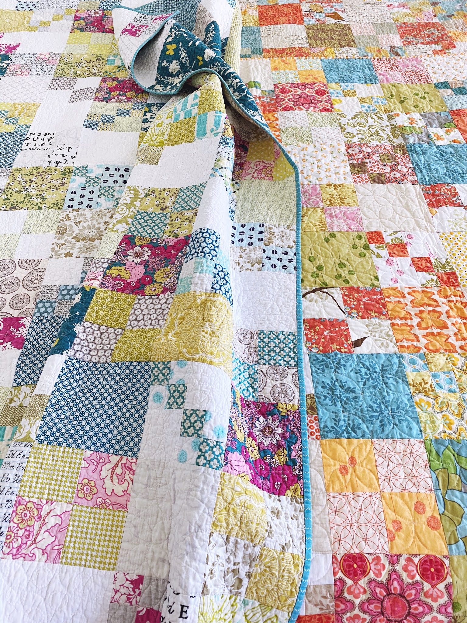
at this point, i was determined to use only fabric from the craft south stack for the front and back of the quilt, if possible. so i had to begin piecing a few things together and making some decisions about what to use where, particularly for the remaining piece of the lououthi 2 yd cut.

i did want to use what was left after i cut off the cabin hearth piece as one giant piece on the back. however, when i redid the front, i was in need of another long side piece. i figured out how to do that with a bit left over from the hearth piece and a narrow strip fussy cut off the backing piece.

i tried to pattern match the two pieces and nearly did it correctly. i was so nervous about getting it right! and in the end, even though i was off by 1/4", it turned out pretty good.

originally, i knew i needed to account for the seam allowance on both pieces by adding 1/4" to each line where the pattern would meet up. but somehow when it came to cutting, i forgot and only made allowance for the seam on one of the pieces. oh, well. not perfect, but pretty good.


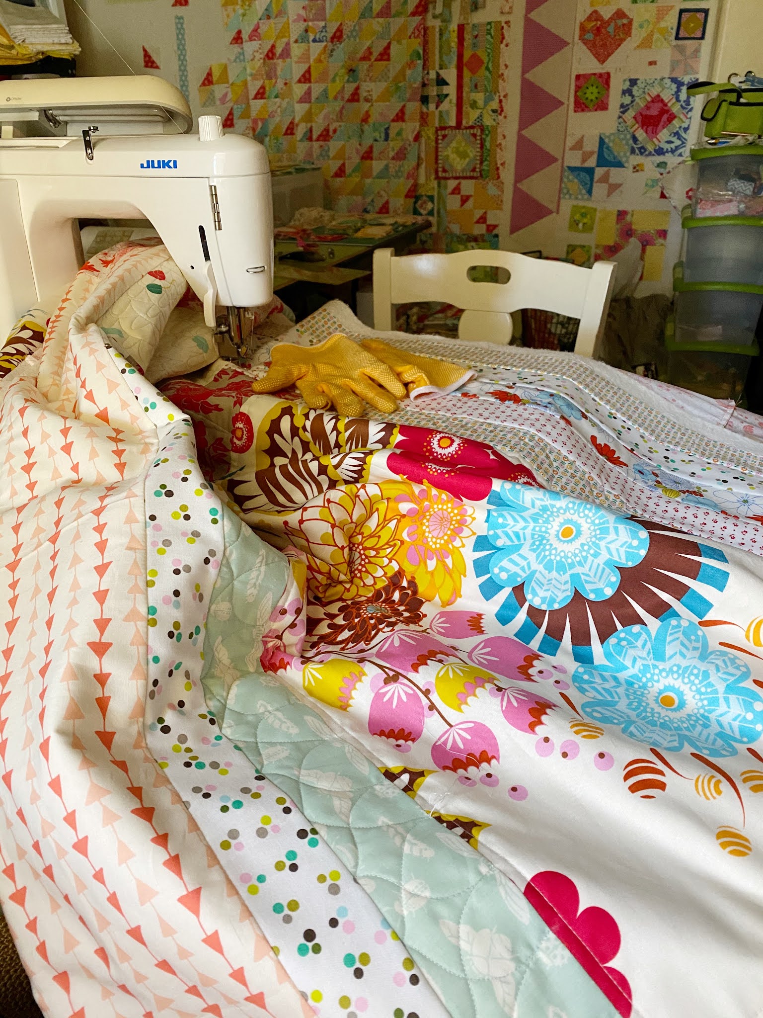
piecing the back of this quilt was far more work and mental effort than the front, which I actually had a pattern in mind for while i was making it. the back had to be figured out piece by piece as I went along. 

i'm pleased with the results, and was able to make the whole thing from my original pile of fabrics. since i was already taking the time to piece it so carefully, i made the extra effort of fussy cutting the balloon fabric for placement within the strips. the designs on this fabric were very spread out on the fabric, with a lot of white space in between. i didn't want to loose the balloons and kites in the cutting, so fussy cutting was in order. it makes for some fun little "i spy" bits on the back.


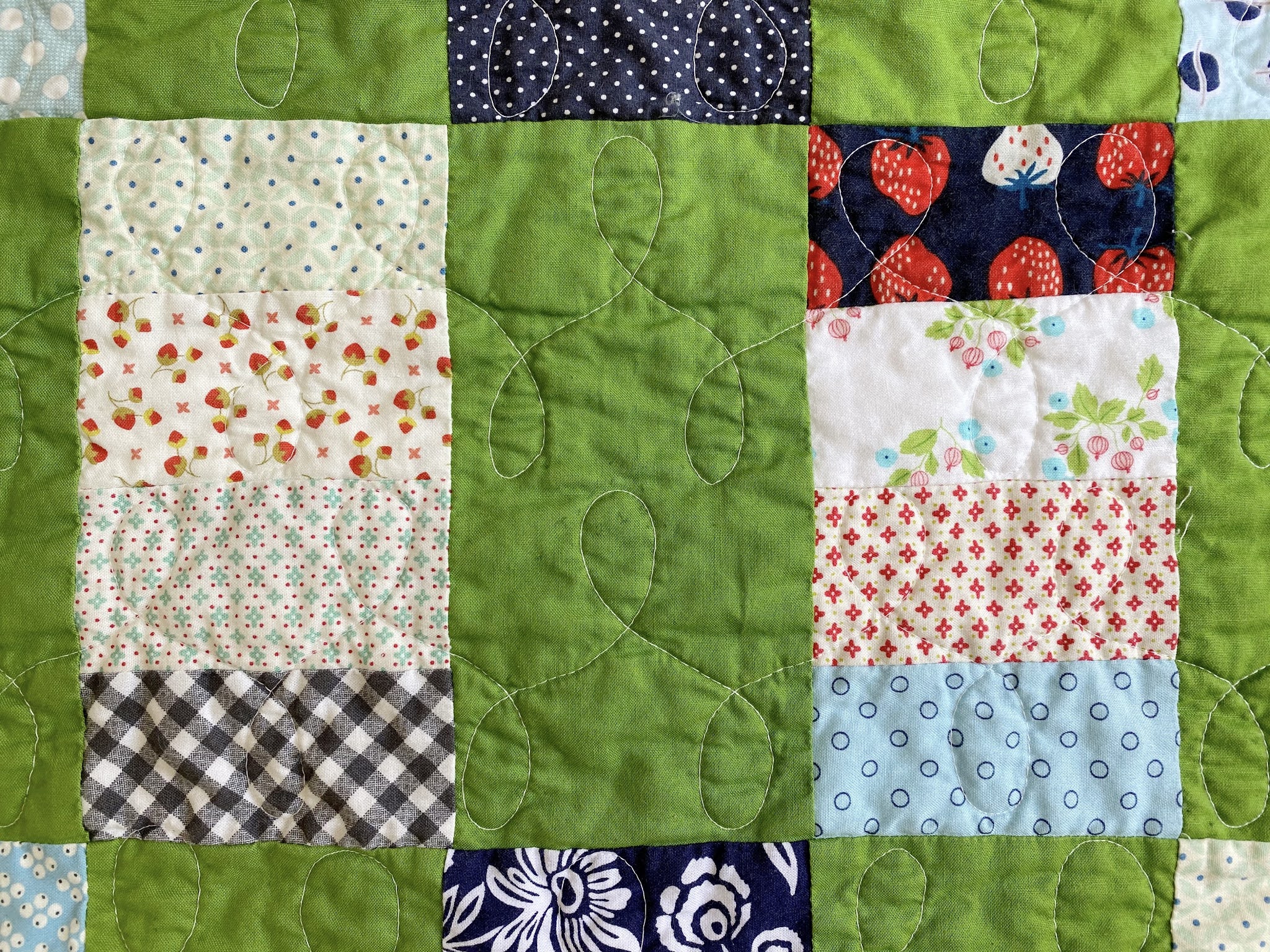
now i'm to the quilting phase. i had this fmq book out on my sewing table for some reason and since i didn't know what i wanted to do for this quilt, i opened it for ideas. i've been trying some of the designs out on various parts of the quilt. really, i should practice them somewhere else first, but i'm too impatient for that. angela's designs are so beautifully executed after her years of extensive practice. i shouldn't be sucked in and think i can reproduce them instantly, especially when i'm so rusty. if i had at least doodled by hand a little first, i could have got the proportions of the short and tall bumps down better. i do wish i hadn't picked an absolutely new design for the balloon/kite print area because it's quite visible. but here we are and it is what it is. the final wash and crinkle usually help hide fmq imperfections a bit, too. that's what i'm counting on, anyway.

wish me luck on the rest!

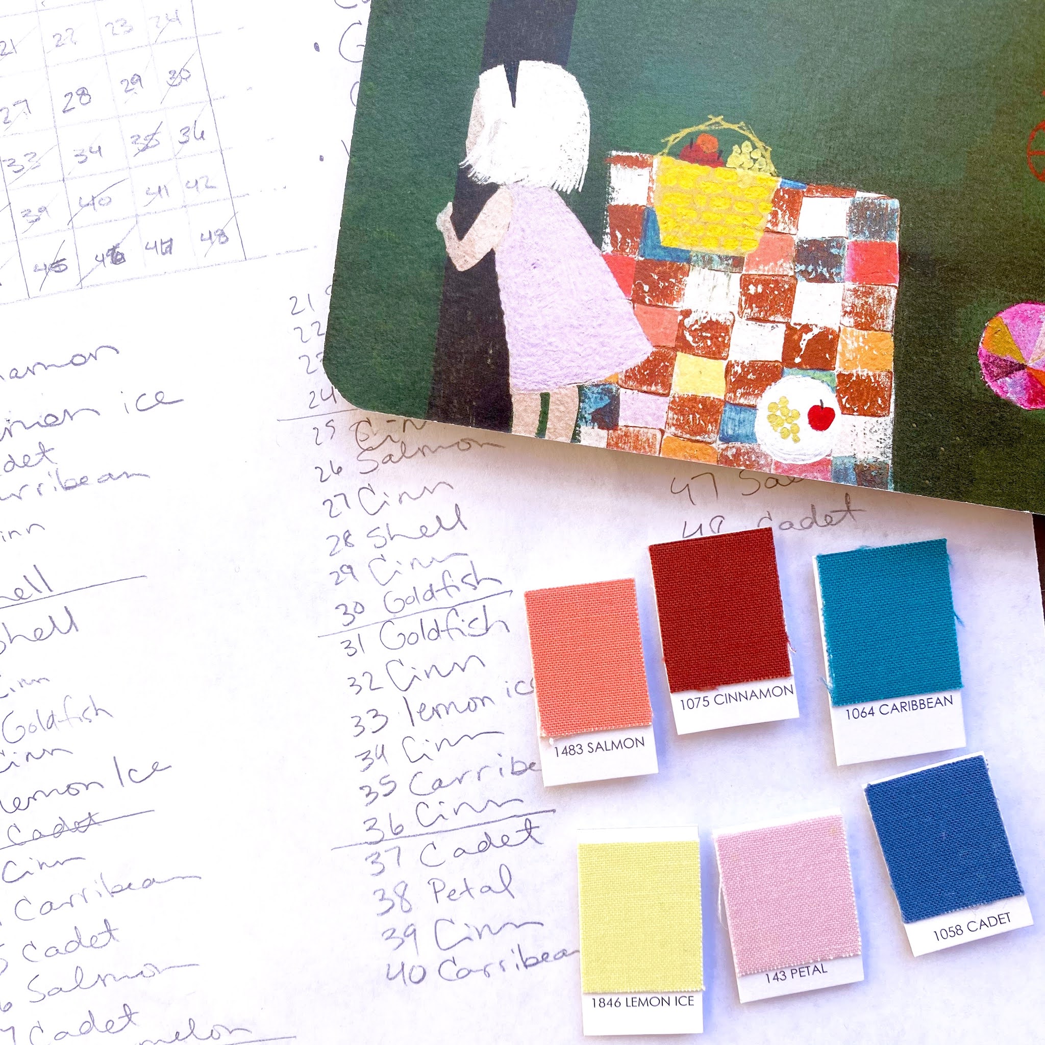
while working on this post, i realized there are 12 fabrics in this quilt. so i'm going to call it "twelve south," which is the district in nashville where craft south resides. i like the symmetry and reference found in that.

Thursday, March 18, 2021

the pleasantest thing


this little lady is sewing her first quilt!
d5, youngest of my 5 daughters, has been helping me sew quilts since she could place her pudgy baby hands on mine and push fabric through the machine. now she's nine and ready to do her own quilting.


it all started with this beloved book - the swing by robert louis stevenson, illustrated by julie morstad - which is a beautifully pictured version of this sweet peom. a few years ago, about when she was five, d5 memorized this poem as part of our homeschool curriculum. we always loved how there was a patchwork quilt in one of the illustrations and said someday we should make that very quilt.


a few weeks ago when she was showing interest in quilting, we stopped talking and got planning.

we decided on 8" finished squares to give us a size we liked (48"x64"). i made a little grid to represent the quilt as pictured in the book (6x8), then we identified kona cotton solid colors that we thought best represented the colors in the illustration, picking a color for each square. 

the book quilt almost follows a pattern of every-other-square being a warm, spice brown color, but on some of those squares, the illustrator colored over the brown with a blue. d5 picked kona 1075 cinnamon for her background brown. i thought it was a little deep-toned, but i let her make the final decision. we chose kona 1058 cadet for the blue-grey washed over alternate background squares.

the other squares were a variety of colors that in some cases appeared to be tones of the same color. i let her make the call about which colors she wanted to use for the squares where it was questionable which shade was most accurate. some of the squares were very light, almost white, but we wanted color not white for them, so d5 picked shell for those. (in case you're looking closely and wondering - i don't have color chips for shell, goldfish, or watermelon, which are more colors we used. we used the most current kona color card to pick our colors.) 

there is one square very close to the little girl's skirt in the illustration that is more pink than all the other shell pink squares. we chose kona 143 petal for this one square as a special accent.


then we went shopping.
i meant to do all the maths before we went to the store so i could get the right amounts of yardage for each color, but i didn't get that done ahead of time. i don't mind having more solid colors hanging around, so i opted to get 2 yards of cinnamon (background color), 1 yard cadet (2dnary background and binding) and 1/2 yards of everything else. this was generous sizing as some of the colors only appear 2 or 3 times.

here is our color palette, left to right:
1075 cinnamon (main/background color)
474 goldfish
143 petal
1064 carribean
1846 lemon ice
1483 salmon
1058 cadet
1384 watermelon
1271 shell


we got cutting and stitching on a lovely, lazy, stay-in-jammies kind of weekend afternoon. she'd press the color and i'd cut the squares, then she'd lay them out on a piece of batting on the floor. (my design walls are currently all covered and this is my preferred method when wall space isn't available.)

when only the first 3 squares were laid out, she excitedly exclaimed, "mom, look! it's so beautiful!"


once the cutting was done, the stitching began. i'd pick up a row and then hand her pairs of squares to join, having her chain piece as i snipped them apart for her. after a while she said, "you're doing all the hard work. i'm just stitching." haha! i told her the stitching was the most important at the moment and i sure wished i had someone to cut my fabric or stand next to me and hand me all my pieces when i was sewing quilts. 

i had her sewing on the turtle setting for speed (juki's lowest setting). after a few rows, she asked to speed up. i told her as it was her very first quilt i thought she should continue on the turtle to get used to sewing straight even though she was doing a really good job. she complied for a few more squares and then i could hear the machine working at a faster pace. a few squares in she moved back down to turtle and said in a resigned voice, "sorry i doubted you, mom. you were right. i should have trusted your experience. kids just don't like to be told what to do." 

she was supposed to be backstitching over the seam junctures when sewing the rows together. i like to do this for reinforcement. every now and then she'd forget. one of the times she forgot, she said, "well, that was horrifying. it broke my heart." i have a bit of a perfectionist on my hands here. there was something else i told her to do that she questioned and i told her, "well, ou need to do it if you care about accuracy." her reply, "which i do. if you think i don't, you don't know me very well."

i showed her how to press the seams as we completed each row. conquering seam pressing is more difficult than stitching, and harder for me to be patient about with the learner. but we managed. we pinned rows together and she did a great job sewing those, too. the majority of her points match up perfectly and the others are barely off. (pinning doesn't work any better for me, either.)  i really am impressed how accurate her 1/4" seams turned out. she seems born to quilt.

we had to stop for dinner, but she wanted to push through and finish the whole top. she genuinely enjoyed the stitching. while sewing away she would randomly make exclamations like, "i love sewing!" it was a real joy to work alongside her and watch her develop this new skill.


by bedtime, we had a completed quilt top - her very first. she's so happy with it and i'm so happy with her. the way the colors are laid out isn't exactly how i would have placed them if i were choosing for myself, but it is a faithful reproduction of the quilt in the illustration. we love it. it feels like something you'd find in an old farmhouse that your great-grandma made from scraps. we call it "the pleasantest thing" which comes from a line on the same page as the quilt illustration in the book.


backing, quilting, and binding coming up.

and then we have plans for more quilts inspired by the book! there aren't anymore quilts in the pictures, but each page is an absolute delight in color palette and layout, so we've got lots of ideas for a series to represent each illustration. 

i can't think of anything more pleasant to do with this girl.

Wednesday, March 3, 2021

WIP wednesday 2021.9


for many people, the pandemic conditions of the past year have meant a lot of extra down time at home to focus on hobbies or learning new skills. it was one of the positives in a strange, suddenly jumbled new world. 

however, for me, the opposite was true. even though we're homeschoolers and already home a lot, having all of us home all the time for-reals, plus the added stresses and requirements of quarantine conditions, meant i basically said "goodbye" to quilting. 

i did treasure the added focus on family and time together, but there were the days when i thought, "can i just go quarantine in my sewing room like everyone else seems to be doing?"

if you browse the few posts here or my instagram account for last year, you'll see i did very little sewing ever. but one thing i did manage to do was quilt and trim a stack of quilts, as well as make the bindings for them.

this past saturday, i suddenly found myself with a few spare hours and decided to get some of those bindings put on by machine so i could do the handwork portion as opportunities arose. they were so close to being done and i didn't want to have them sitting around for several more months unfinished.

besides, the living room needed an infusion of new quilts and colors, and i knew where to find some fast.

three quilts i wanted for spring/summer service got their bindings attached.


somehow, i managed to get the first quilt, collins, completely bound by sunday night. don't look at me! i have no idea how that happened. d3 and i did some catching up on wandavision episodes and watched newsies on saturday night, and then i snuck some stitches in while waiting for a church meeting and during family games on sunday night. 

done.

two days.

that's absolutely a first for me.


monday and tuesday evening, the girls and i watched north and south and i took the next quilt, sunny geese, along to some appointments. 

well, it got done yesterday evening.

here we are on  wednesday and it's time to report what's in progress: summer berry fields went along to the dentist this morning and is on its way now, too.

who am i?
apparently, i'm the lady who's going to have 3 quilts bound and finished this week.

Saturday, January 30, 2021

penny patch 3 block variation: process, musings, & a loose tutorial


earlier today i pulled out all three versions of the penny patch pattern i've made over the years and gave them a look. then i saw a new version that jolene is making over at blue elephant stitches, and it reminded me that once apon a time (october 2015) i started working on a tutorial for a 3 block version of this pattern. 

i dug in the blog archives and found this post in my drafts. i had intentions of finishing this as a tutorial someday, but no longer know where i was going with any of that! so i'm just going to add a few photos and publish my thoughts on the process of making this pattern, which is such a classic. perhaps someday i'll make another one (something i'd like to do) and i'll work up a detailed tutorial at that point.
here i am merely building on the groundwork laid by rachel at stitched in color.

now, enter the inner workings of my mind as i contemplate discoveries i've made about fabric selection and placement of fabrics in this really wonderful pattern.


vintage tangerine and my penny patch

in the fall of 2014, rachel hauser of stitched in color ran a quiltalong for her penny patch quilt pattern. it's a great pattern for a quilter of any skill level, from beginner to seasoned, because while it's a good pattern to learn on, it also allows for enough color and pattern play to interest advanced quilters, too.

being completely smitten with rachel's original penny patch quilt, the vintage tangerine, i eagerly hopped on board the quilt along. there were so many great versions of the pattern that emerged during that quilt along (penny patch finishes link party here).

while making my first version of the penny patch, which i never named anything more than penny patch, i studied rachel's original quite extensively to get a better understanding of what it was i loved about hers so much. during this process i noticed one thing rachel did to simplify the quilt pattern for her quiltalong target audience, the beginners, was to use only two block types in her quiltalong version. i decided i liked the play of the 3 block style better, so i adopted it for my own quilt. the added bonus was that by using the simple 4 square block, in addition to the large block and penny patch block, i saved time because it involved less sewing.

also, when using the simplified, two block pattern, a strong secondary pattern emerges from the continuous flow of the penny patches on the diagonal. my personal preference was a more mixed, scattered layout that used 3 block types, with variations in the pattern.


 making that first penny patch was a journey of learning and discovery for me, an organic process that changed and grew as i went along. before i was done with the top, i already had a fabric pull planned for a second version of the pattern, my penny patch 2.0, and a third one planned from all the leftover pieces that didn't make it into my first quilt, which i call leftover pennies. because i enjoy this pattern so much, i might also have a plan to make one for each season of the year. maybe. as i've been working on 2.0, i thought there might be others out there interested in the 3 block variation of the pattern. so i'm offering a loose tutorial of how to make a 3 block penny patch.

this is not a complete tutorial for a beginner, but rather instructions for cutting requirements and assembly, as well as thoughts on fabric selection. if you want excellent, step-by-step directions for making this quilt pattern (in a simplified 2 block version), please refer to rachel's quiltalong series.

some people asked me to share what i discovered during the process of my first penny patch. those thoughts are woven in here, too. i have tried laying out this tutorial in several different ways but since it is a compilation of my thoughts as they evolved during the process of working my way thru two different versions of this quilt, it's not completely straight forward. i'll give the basic stats on the quilt and talk about fabric selection ideas before giving any cutting instructions or directions.

layout and dimensions


 the 3 block penny patch is composed of, naturally, 3 block types. they are:

  1. single square block - a simple 6.5" cut square (finishes at 6")
  2. 4 square block - composed of 4 - 3.5" cut squares, two of each color (6.5" assembled, 6" finished)
  3. penny patch block - composed of 2 - 3.5" cut squares and 2 penny patch squares (made of 4 - 2" cut squares)
*when i say "square" i am referring to one square of fabric that's been cut from the yardage. once squares are joined together, they become a "block", except in the case of the "single sq block," which is a block made up of one single square.


the quilt pattern is simple. it consists of two types of rows which alternate with each other throughout the quilt:
  • row A - single sq blocks and 4 sq blocks, alternating. begins with a single sq block 
  • row B - single sq blocks and penny patch blocks, alternating. begins with a penny patch block

for a lap size quilt, this results in the following dimensions and number of blocks:
  • 60" x 72" quilt
  • 120 blocks, each 6.5" cut/assembled (6" finished)
  • 10 blocks per row, 12 rows


making fabric selections


the original scrappy inspiration for the penny patch, vintage tangerine, and 2.0

before laying out fabric requirements for this quilt, let's talk about fabric selections. you can totally go very colorful with this quilt (like the multi-colored inspiration penny patch on the bed above, left), or you can pare down your palette and follow rachel's guidelines she gave for getting the look of vintage tangerine, given here. i was so engrossed with studying rachel's vintage tangerine to see what made it tick that i actually printed a picture of it, then noted which fabrics she used, how often, and where. that seems a little extreme and maybe a waste of time, but actually this exercise really helped me decode some of the magic. here are thoughts i have about selecting fabrics for this quilt:
  • color theory  to get the bright, vintage look of vintage tangerine, rachel recommended using about half low-volume/neutral fabrics and having a 3 color palette - two contrasting colors, one to be the main color (color A) and one to compliment (color B), and a tiny bit of a pop color (color C) for interest and more contrast. refer to her discussion of color selection for an excellent working base on the color theory behind this quilt.
  • color proportions  i used approximately 10-12 different low-volume/neutral fabrics, 8 or 9 of my main fabric color A, 11 or 12 of my complimentary fabric color B, and 1 to 3 of my pop color C. you can certainly do with less fabric variety but to get the most color play and a great scrappy mix, go for more fabrics! (to be exact, in penny patch i used 31 different fabrics and in 2.0 i used 41 prints.)
  • print quantity  certain prints were used several times, 9 - 12. many were used moderately about 5 - 6 times. a few prints were used only 2 or 3 times. prints that i wanted to use a lot, i deliberately cut many of. the rest got used based on where i felt i needed some of that color, or a variation from the other prints in that color in a certain area. having so many prints in one quilt gives it lots and lots of variety and interest. yet the limited color palette and mood theme splendidly keeps it all in harmony.
  • focal print  rachel used the "flea market fancy" orange bouquet print heavily in vintage tangerine, sort of as a focal print. i did the same thing with joel dewberry's "bungalow" dainty daisy print for my 2.0 quilt. the print i chose actually had all of my colors for the quilt in it and i think it helps tie everything together nicely. i featured it once in each row of the quilt and also used it on the back. because it is a larger-scaled print, i only used it for single sq blocks.


  • mood theme  each of my penny patch quilts has a mood theme to it that helped guide my fabric style choices. penny patch no.1 has a vintage 60's/70's feel to it; fabrics that might have been around just before or at the time of my birth in the early 70's. i chose mostly circle geometrics and florals, like the woodcut prints, that had the feel of that era to me. "first day of school" is what 2.0 says to me. it is composed of school-ish text prints, rich, pretty florals like i might have chosen for a first day of school dress, plaids, and more circle geometrics. i also chose 3 white, closed-eyelet fabrics for my low-volumes in 2.0. my 3rd penny patch, which i'm already calling leftover pennies because it's going to be made of the leftovers/culled pieces from penny patch, has a soft spring-like mood. this one will actually use five colors, not three. however, they blend well and so closely that it doesn't feel like that many colors.


cuts for leftover pennies

  • text prints  in both quilts i used a couple of text prints because i loved the look of them mixed with the other prints in vintage tangerine.
  • size matters  i found it created more contrast and interest if i didn't use each fabric for each of the 3 sizes of blocks. i might use a certain fabric for single square blocks and penny patches, but not 4 patch blocks. some fabrics i used for only one size block. this kept the quilt looking more scrappy and gave it a "use what you have" look since it didn't appear i was working with an abundance of each fabric. it also helped me spread the fabrics around the quilt more and made it easier to not have the same fabric in two sizes touching itself (which i don't prefer). in the beginning i decided which fabrics i wanted to feature more or picked the largest prints and used those for my single square blocks. any really tiny (small scale) prints were mostly delegated to the penny patch blocks, except the very low-volume prints because they created white space in the top when used as single sq blocks.

lots of a light base showing in the color picks will brighten the quilt

  • shades  the shade of low-volumes you choose affects the feel of the quilt. in penny patch no.1, most of the low-volumes have a cream colored base and this gives the quilt a warmer, more antique feel. in 2.0 i tried to find low-volumes with a white base to give a cleaner, brighter look to the quilt. rachel used a lot of grey prints in vintage tangerine, which contributed to a cool feel and also contrasted with the warm colors. you can certainly mix the different color bases up but just keep in mind the effect having more of one or the other will produce in the look of your quilt.
  • brighten it  if you want a brighter look to your quilt, like vintage tangerine, then go for a lot of low-volume prints. looking at rachel's fabric picks, even some of her color choices are rather low-volume: they have a strong white base and just some of the color rather than being color saturated. this gives the colors a lot of room to shine out against all the low-volume squares which actually makes them stand out more than if there were more color-dense fabrics. just look at my penny patch no. 1 and you'll see what more color-dense fabrics look like instead.

panny patch no.1, fall 2013 - more warm and color dense thanks to cream-based low-volumes and richly-hued, color-saturated prints

fabric requirements


cuttings for penny patch 2.0
giving specific fabric requirements for this quilt is rather hard because i found the number of prints i wanted for this quilt changed as i worked my way thru the layout. however, having a quarter yard/fat quarter of any fabric you plan on using is a generous and safe starting point. i did not do all my cutting at once, either. i cut about 1/4 of my needs first and began laying the top out. then i could decide if i wanted more of anything or if i needed to add another bit of something else, and cut as needed in small batches from there. however, for some basic and quick guidelines for those not interested in putting that much time and thought into the process, here are the essential fabric needs for this quilt. just be aware that even these will give you some scraps and leftovers.

  • 4 Fat Quarters in color A
  • 4 Fat Quarters in color B
  • 1 Fat Quarter in POP color C
  • 1 Fat Quarter in mid-value neutral (gray or brown)
  • 10 Fat Quarters low volume
  • 1/2 yd binding fabric
  • 4 yds backing fabric

i used more than twice as many color prints in each of my quilts and just a few more low-volume prints. obviously, i wouldn't need a full fat quarter of each. i like scraps so i started with 1/4 yd of each of these prints. that was plenty and then some! you could certainly rummge through your scraps for appropriate-sized pieces to use in this quilt.

cutting


the basic building blocks - 6.5" single sq, penny patch, 3.5" sq

once you have decided what fabrics you will use for which kind of blocks, you can begin cutting to achieve these numbers:

  • 60 - 6.5" single sq blocks
  • 180 - 3.5" squares, in 90 matching pairs (60 pairs for 30 - 4 patch blocks; 30 pairs for use in 30 penny patch blocks)
  • 120 - 2" penny patch squares, in 60 matching pairs sets (paired with 3.5" squares to create 60 penny patch blocks). these will actually be made by cutting strips for strip piecing. for each penny patch block, 2 - 8"x2" strips are needed to create the pair of penny patches (that mini 4 sq block of 2" sqs). therefore,  60 - 8"x2" strips are needed (rachel's instructions for assembly here.)


assembly

i've kind of worked my way backwards through this explanation, feeling you needed to see the layout of the quilt to understand what you were selecting fabrics for. you are going to now cut your fabrics and make your blocks.

i've already told you how many of each square and block type you need to cut. let's get to work on that cutting, layout, and sewing together. once i tell you a few things about the layout, you're going to fly on your own as you assemble the blocks. this "tutorial" assumes you know how to connect blocks into rows and rows into a quilt top.

if you are confident about how many of each fabric you want for each block, then go ahead and do all your cutting first. or have fun with the creative process of selecting and cutting as you go. it is a lengthier process to approach a quilt this way, but you might find you enjoy immersing yourself in the selections more fully by cutting as you go. it also keeps you from overcutting or cutting unnecessarily once you decide you don't like the way something is working in your quilt.


this is the kind of quilt where a design wall, or even floor space, comes in really handy. begin laying out one row at a time, then assemble the blocks within the row, and finally joining the row.

reminder of what your rows look like:


start with a row of single-sq blocks and penny patch blocks, alternating each type across the row, until you have 10 blocks across (5 of each).

the next row will consist of 4 sq blocks and single-sq blocks, again alternating across the row (10 blocks, 5 of each). when placing the blocks together, make sure you alternate the position of the single-sq blocks so they don't layer on top of each other in the columns.

your quilt top is going to look like a checkerboard of single squares alternated with the penny patch and 4 sq blocks.

something else to consider during layout is the placement of the little penny (2") squares in the penny patch blocks. if you look at my quilt above, you will notice my little pennies are scattered throughout the quilt. they do not create a distinctive secondary pattern or lattice throughout the quilt because of two conscious decisions i made:
  • i alternated the directionality of the penny squares within the penny patch blocks
  • i alternated the value placement of colors within the penny patch blocks
here's a visual:


for the penny patch block on the left, the little penny blocks are placed in the upper left and lower right positions, and the more dominant/noticeable of the two fabrics used are flowing from lower left to upper right (along the arrows).

the penny patch block on the right has the opposite placement of the little penny blocks within the larger block, being in the upper right and lower left corners, but all 4 of the dominant/noticeable turqouise-colored penny squares are still laid out moving from lower left to upper right (along the arrow).


in these two penny patch blocks, the more noticable pennies are lined up, but flowing in opposite directions from each other because their placement in the block is different.

you can see there are several effects that can be achieved depending on value placement and directionality within the penny patch blocks themselves.

i chose to mix these variations throughout the quilt to give my little penny patches a sprinkling effect rather than a continuous pattern.

here's one more look at each of my versions of the penny patch 3 block variation (so far) and links to posts about them:


penny patch (original): penny patch sudoku


penny patch 2.0, school pennies: beginsplan cpile o' fabricdelayswip tuesday, quiltingfinish 


leftover pennies: finish and memorial