Saturday, January 30, 2021

penny patch 3 block variation: process, musings, & a loose tutorial


earlier today i pulled out all three versions of the penny patch pattern i've made over the years and gave them a look. then i saw a new version that jolene is making over at blue elephant stitches, and it reminded me that once apon a time (october 2015) i started working on a tutorial for a 3 block version of this pattern. 

i dug in the blog archives and found this post in my drafts. i had intentions of finishing this as a tutorial someday, but no longer know where i was going with any of that! so i'm just going to add a few photos and publish my thoughts on the process of making this pattern, which is such a classic. perhaps someday i'll make another one (something i'd like to do) and i'll work up a detailed tutorial at that point.
here i am merely building on the groundwork laid by rachel at stitched in color.

now, enter the inner workings of my mind as i contemplate discoveries i've made about fabric selection and placement of fabrics in this really wonderful pattern.


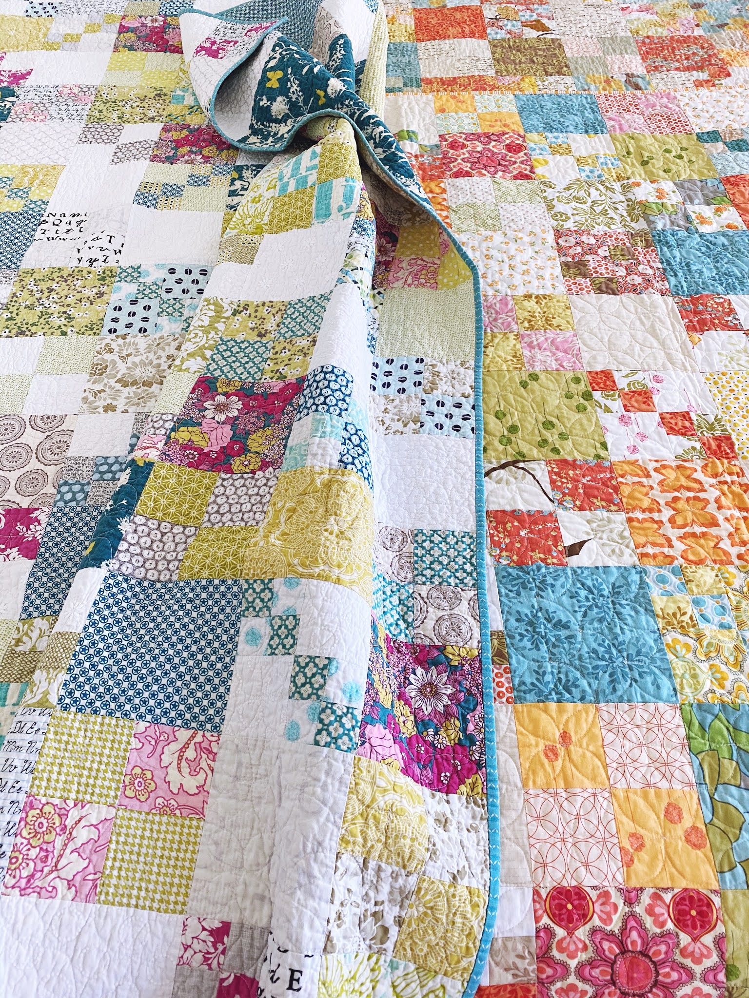
vintage tangerine and my penny patch

in the fall of 2014, rachel hauser of stitched in color ran a quiltalong for her penny patch quilt pattern. it's a great pattern for a quilter of any skill level, from beginner to seasoned, because while it's a good pattern to learn on, it also allows for enough color and pattern play to interest advanced quilters, too.

being completely smitten with rachel's original penny patch quilt, the vintage tangerine, i eagerly hopped on board the quilt along. there were so many great versions of the pattern that emerged during that quilt along (penny patch finishes link party here).

while making my first version of the penny patch, which i never named anything more than penny patch, i studied rachel's original quite extensively to get a better understanding of what it was i loved about hers so much. during this process i noticed one thing rachel did to simplify the quilt pattern for her quiltalong target audience, the beginners, was to use only two block types in her quiltalong version. i decided i liked the play of the 3 block style better, so i adopted it for my own quilt. the added bonus was that by using the simple 4 square block, in addition to the large block and penny patch block, i saved time because it involved less sewing.

also, when using the simplified, two block pattern, a strong secondary pattern emerges from the continuous flow of the penny patches on the diagonal. my personal preference was a more mixed, scattered layout that used 3 block types, with variations in the pattern.


 making that first penny patch was a journey of learning and discovery for me, an organic process that changed and grew as i went along. before i was done with the top, i already had a fabric pull planned for a second version of the pattern, my penny patch 2.0, and a third one planned from all the leftover pieces that didn't make it into my first quilt, which i call leftover pennies. because i enjoy this pattern so much, i might also have a plan to make one for each season of the year. maybe. as i've been working on 2.0, i thought there might be others out there interested in the 3 block variation of the pattern. so i'm offering a loose tutorial of how to make a 3 block penny patch.

this is not a complete tutorial for a beginner, but rather instructions for cutting requirements and assembly, as well as thoughts on fabric selection. if you want excellent, step-by-step directions for making this quilt pattern (in a simplified 2 block version), please refer to rachel's quiltalong series.

some people asked me to share what i discovered during the process of my first penny patch. those thoughts are woven in here, too. i have tried laying out this tutorial in several different ways but since it is a compilation of my thoughts as they evolved during the process of working my way thru two different versions of this quilt, it's not completely straight forward. i'll give the basic stats on the quilt and talk about fabric selection ideas before giving any cutting instructions or directions.

layout and dimensions


 the 3 block penny patch is composed of, naturally, 3 block types. they are:

  1. single square block - a simple 6.5" cut square (finishes at 6")
  2. 4 square block - composed of 4 - 3.5" cut squares, two of each color (6.5" assembled, 6" finished)
  3. penny patch block - composed of 2 - 3.5" cut squares and 2 penny patch squares (made of 4 - 2" cut squares)
*when i say "square" i am referring to one square of fabric that's been cut from the yardage. once squares are joined together, they become a "block", except in the case of the "single sq block," which is a block made up of one single square.


the quilt pattern is simple. it consists of two types of rows which alternate with each other throughout the quilt:
  • row A - single sq blocks and 4 sq blocks, alternating. begins with a single sq block 
  • row B - single sq blocks and penny patch blocks, alternating. begins with a penny patch block

for a lap size quilt, this results in the following dimensions and number of blocks:
  • 60" x 72" quilt
  • 120 blocks, each 6.5" cut/assembled (6" finished)
  • 10 blocks per row, 12 rows


making fabric selections


the original scrappy inspiration for the penny patch, vintage tangerine, and 2.0

before laying out fabric requirements for this quilt, let's talk about fabric selections. you can totally go very colorful with this quilt (like the multi-colored inspiration penny patch on the bed above, left), or you can pare down your palette and follow rachel's guidelines she gave for getting the look of vintage tangerine, given here. i was so engrossed with studying rachel's vintage tangerine to see what made it tick that i actually printed a picture of it, then noted which fabrics she used, how often, and where. that seems a little extreme and maybe a waste of time, but actually this exercise really helped me decode some of the magic. here are thoughts i have about selecting fabrics for this quilt:
  • color theory  to get the bright, vintage look of vintage tangerine, rachel recommended using about half low-volume/neutral fabrics and having a 3 color palette - two contrasting colors, one to be the main color (color A) and one to compliment (color B), and a tiny bit of a pop color (color C) for interest and more contrast. refer to her discussion of color selection for an excellent working base on the color theory behind this quilt.
  • color proportions  i used approximately 10-12 different low-volume/neutral fabrics, 8 or 9 of my main fabric color A, 11 or 12 of my complimentary fabric color B, and 1 to 3 of my pop color C. you can certainly do with less fabric variety but to get the most color play and a great scrappy mix, go for more fabrics! (to be exact, in penny patch i used 31 different fabrics and in 2.0 i used 41 prints.)
  • print quantity  certain prints were used several times, 9 - 12. many were used moderately about 5 - 6 times. a few prints were used only 2 or 3 times. prints that i wanted to use a lot, i deliberately cut many of. the rest got used based on where i felt i needed some of that color, or a variation from the other prints in that color in a certain area. having so many prints in one quilt gives it lots and lots of variety and interest. yet the limited color palette and mood theme splendidly keeps it all in harmony.
  • focal print  rachel used the "flea market fancy" orange bouquet print heavily in vintage tangerine, sort of as a focal print. i did the same thing with joel dewberry's "bungalow" dainty daisy print for my 2.0 quilt. the print i chose actually had all of my colors for the quilt in it and i think it helps tie everything together nicely. i featured it once in each row of the quilt and also used it on the back. because it is a larger-scaled print, i only used it for single sq blocks.


  • mood theme  each of my penny patch quilts has a mood theme to it that helped guide my fabric style choices. penny patch no.1 has a vintage 60's/70's feel to it; fabrics that might have been around just before or at the time of my birth in the early 70's. i chose mostly circle geometrics and florals, like the woodcut prints, that had the feel of that era to me. "first day of school" is what 2.0 says to me. it is composed of school-ish text prints, rich, pretty florals like i might have chosen for a first day of school dress, plaids, and more circle geometrics. i also chose 3 white, closed-eyelet fabrics for my low-volumes in 2.0. my 3rd penny patch, which i'm already calling leftover pennies because it's going to be made of the leftovers/culled pieces from penny patch, has a soft spring-like mood. this one will actually use five colors, not three. however, they blend well and so closely that it doesn't feel like that many colors.


cuts for leftover pennies

  • text prints  in both quilts i used a couple of text prints because i loved the look of them mixed with the other prints in vintage tangerine.
  • size matters  i found it created more contrast and interest if i didn't use each fabric for each of the 3 sizes of blocks. i might use a certain fabric for single square blocks and penny patches, but not 4 patch blocks. some fabrics i used for only one size block. this kept the quilt looking more scrappy and gave it a "use what you have" look since it didn't appear i was working with an abundance of each fabric. it also helped me spread the fabrics around the quilt more and made it easier to not have the same fabric in two sizes touching itself (which i don't prefer). in the beginning i decided which fabrics i wanted to feature more or picked the largest prints and used those for my single square blocks. any really tiny (small scale) prints were mostly delegated to the penny patch blocks, except the very low-volume prints because they created white space in the top when used as single sq blocks.

lots of a light base showing in the color picks will brighten the quilt

  • shades  the shade of low-volumes you choose affects the feel of the quilt. in penny patch no.1, most of the low-volumes have a cream colored base and this gives the quilt a warmer, more antique feel. in 2.0 i tried to find low-volumes with a white base to give a cleaner, brighter look to the quilt. rachel used a lot of grey prints in vintage tangerine, which contributed to a cool feel and also contrasted with the warm colors. you can certainly mix the different color bases up but just keep in mind the effect having more of one or the other will produce in the look of your quilt.
  • brighten it  if you want a brighter look to your quilt, like vintage tangerine, then go for a lot of low-volume prints. looking at rachel's fabric picks, even some of her color choices are rather low-volume: they have a strong white base and just some of the color rather than being color saturated. this gives the colors a lot of room to shine out against all the low-volume squares which actually makes them stand out more than if there were more color-dense fabrics. just look at my penny patch no. 1 and you'll see what more color-dense fabrics look like instead.

panny patch no.1, fall 2013 - more warm and color dense thanks to cream-based low-volumes and richly-hued, color-saturated prints

fabric requirements


cuttings for penny patch 2.0
giving specific fabric requirements for this quilt is rather hard because i found the number of prints i wanted for this quilt changed as i worked my way thru the layout. however, having a quarter yard/fat quarter of any fabric you plan on using is a generous and safe starting point. i did not do all my cutting at once, either. i cut about 1/4 of my needs first and began laying the top out. then i could decide if i wanted more of anything or if i needed to add another bit of something else, and cut as needed in small batches from there. however, for some basic and quick guidelines for those not interested in putting that much time and thought into the process, here are the essential fabric needs for this quilt. just be aware that even these will give you some scraps and leftovers.

  • 4 Fat Quarters in color A
  • 4 Fat Quarters in color B
  • 1 Fat Quarter in POP color C
  • 1 Fat Quarter in mid-value neutral (gray or brown)
  • 10 Fat Quarters low volume
  • 1/2 yd binding fabric
  • 4 yds backing fabric

i used more than twice as many color prints in each of my quilts and just a few more low-volume prints. obviously, i wouldn't need a full fat quarter of each. i like scraps so i started with 1/4 yd of each of these prints. that was plenty and then some! you could certainly rummge through your scraps for appropriate-sized pieces to use in this quilt.

cutting


the basic building blocks - 6.5" single sq, penny patch, 3.5" sq

once you have decided what fabrics you will use for which kind of blocks, you can begin cutting to achieve these numbers:

  • 60 - 6.5" single sq blocks
  • 180 - 3.5" squares, in 90 matching pairs (60 pairs for 30 - 4 patch blocks; 30 pairs for use in 30 penny patch blocks)
  • 120 - 2" penny patch squares, in 60 matching pairs sets (paired with 3.5" squares to create 60 penny patch blocks). these will actually be made by cutting strips for strip piecing. for each penny patch block, 2 - 8"x2" strips are needed to create the pair of penny patches (that mini 4 sq block of 2" sqs). therefore,  60 - 8"x2" strips are needed (rachel's instructions for assembly here.)


assembly

i've kind of worked my way backwards through this explanation, feeling you needed to see the layout of the quilt to understand what you were selecting fabrics for. you are going to now cut your fabrics and make your blocks.

i've already told you how many of each square and block type you need to cut. let's get to work on that cutting, layout, and sewing together. once i tell you a few things about the layout, you're going to fly on your own as you assemble the blocks. this "tutorial" assumes you know how to connect blocks into rows and rows into a quilt top.

if you are confident about how many of each fabric you want for each block, then go ahead and do all your cutting first. or have fun with the creative process of selecting and cutting as you go. it is a lengthier process to approach a quilt this way, but you might find you enjoy immersing yourself in the selections more fully by cutting as you go. it also keeps you from overcutting or cutting unnecessarily once you decide you don't like the way something is working in your quilt.


this is the kind of quilt where a design wall, or even floor space, comes in really handy. begin laying out one row at a time, then assemble the blocks within the row, and finally joining the row.

reminder of what your rows look like:


start with a row of single-sq blocks and penny patch blocks, alternating each type across the row, until you have 10 blocks across (5 of each).

the next row will consist of 4 sq blocks and single-sq blocks, again alternating across the row (10 blocks, 5 of each). when placing the blocks together, make sure you alternate the position of the single-sq blocks so they don't layer on top of each other in the columns.

your quilt top is going to look like a checkerboard of single squares alternated with the penny patch and 4 sq blocks.

something else to consider during layout is the placement of the little penny (2") squares in the penny patch blocks. if you look at my quilt above, you will notice my little pennies are scattered throughout the quilt. they do not create a distinctive secondary pattern or lattice throughout the quilt because of two conscious decisions i made:
  • i alternated the directionality of the penny squares within the penny patch blocks
  • i alternated the value placement of colors within the penny patch blocks
here's a visual:


for the penny patch block on the left, the little penny blocks are placed in the upper left and lower right positions, and the more dominant/noticeable of the two fabrics used are flowing from lower left to upper right (along the arrows).

the penny patch block on the right has the opposite placement of the little penny blocks within the larger block, being in the upper right and lower left corners, but all 4 of the dominant/noticeable turqouise-colored penny squares are still laid out moving from lower left to upper right (along the arrow).


in these two penny patch blocks, the more noticable pennies are lined up, but flowing in opposite directions from each other because their placement in the block is different.

you can see there are several effects that can be achieved depending on value placement and directionality within the penny patch blocks themselves.

i chose to mix these variations throughout the quilt to give my little penny patches a sprinkling effect rather than a continuous pattern.

here's one more look at each of my versions of the penny patch 3 block variation (so far) and links to posts about them:


penny patch (original): penny patch sudoku


penny patch 2.0, school pennies: beginsplan cpile o' fabricdelayswip tuesday, quiltingfinish 


leftover pennies: finish and memorial


Friday, November 13, 2020

my flocks


It’s Fall, have you been hearing the geese call? They actually began calling me this summer when I saw a few compelling sunny yellow quilts and decided to make a scrappy yellow quilt of my own with HSTs in a flying geese formation.


My yellows felt very fresh and cheerful, unlike the sunny Summer weather, which was just plain horribly hot. I stuck to buttery, lemony, and very slightly gold tones for my fabric picks. It gave me exactly the impression I was going for. 


I included some really special pieces in just small amounts, mixed in with many blender prints. I finally broke into my Heather Ross stash, which I hardly ever touch! I love her prints and buy them frequently, but I rarely use them  most are novelty prints and I have a hard time mixing them in with my usual picks. However, in this scrappy quilt, they blended perfectly, even the funky ones like the honey bears and those newspaper hats. I’m beginning to get a feel for how to use them, so I think they will be showing up in my work more.


I even splurged on the backing by using a large piece of the Sleeping Beauty print. Unfortunately, I didn’t include the selvage like I meant to. No big loss, but it’s a touch I like to add when I can. I also used up the hats and bears on the back because I wanted to use them in a place I knew they worked and I would like them. I think they make a whimsical surprise on the back that will be fun to discover when using the quilt.

This quilt is all quilted up now. I used the HST squares as a grid for doing an orange peel FMQ pattern. I like how it adds curves to contrast with the angles. I've even got a binding made for this project, but as I have 5 other quilts that need binding completed, I'm thinking these geese won't be in use til after Winter, and that's just fine. The sun will come back out in Spring when it should.


But the geese aren't all hibernating just yet. Early last year I was pondering and lamenting over a lot of my early-on fabric purchases made in the excitement of discovering quilting, and trying to decide what to do with a pile of half-yards I had rashly acquired.  I decided to mix in coordinates from stash, some solids, and make a bunch of geese. These are true flying geese blocks, 4"x8" geese, made with the bloc-loc ruler. I'm using the squares-and-rectangle-trim-and-flip method, so I'm also get loads of HSTs as I go.

I'm getting so many geese out of the yardage I have that I decided to break it into two quilts: one warm, one cool-toned. I made a few early on this year, and the project fell to the wayside. But then my longtime quilty friends Rachel Hauser of Stitched in Color and Lucy Brennan of Charm About You organized a Fall Flying Geese sewalong called "Geesey Geesey" (which my brain misread as "Geesey Geese" for several weeks, haha.)

Rachel has a pattern for her no-waste method and all the info for constructing a flying geese quilt in three different styles. She's a master teacher, so if you'd like to give geese a try, go learn from Rachel. I already had the project underway and was using the ruler, so I'm using the quilt along mainly for motivation to complete these projects. 


I'm calling the cool-toned quilt Olmstead's Geese as I was listening to Genius of Place, a biography of Frederick Law Olmstead when I began the quilt. The greens and blues remind me of his parks and landscape design career. (Such an interesting book, by the way, if you like historical figure biographies. I'm a huge Biltmore and Central Park fan, so it was right up my listening alley.)


the warm-toned quilt has been dubbed Grellow Garden Geese because of the heavy use of "grellow" (greeny-yellows and yellowy-greens) colors in the quilt. I'm using this floral as the inspiration print to guide the additional fabric selections. There are many golden "grellows" in the palette, as well as very light yellows and some spice browns. It's definitely a departure from my usual palette choices: very Fall feeling and with an almost ugly vintage 70's vibe. I imagine you could dig it up out of a chest in someone's attic.


These were some combinations I began with.


I'm currently in the process of adding in the browns from the inspo floral print. I can't say I love any of these on their own, but I'm hoping it all plays nicely when it's done.

So there you have my flocks, flying geese quilts for at least two seasons.

Thursday, November 12, 2020

fall paint lake


A few months ago I wanted a bit more of the yellow Sleeping Beauty Heather Ross print, which I found on Etsy. While I was ordering, I got a few more half yards to build my stash and help justify the shipping cost.

When the package arrived, I was super busy and set it aside, not opening it for a few weeks  (As a fabriholic, that’s pretty busy!) When I did open it up, I’d completely forgotten what I’d ordered and was so surprised to find this beautifully coordinated Fall bundle, accidentally curated by me! I took out the green floral print and light blue Rapunzel, but I thought the rest went together really well. I set it aside until I could decide what to make with it.

Up to this point, I have not been a seasonal quilter in the sense of making quilts with the colors or theme of the current season.  But I find I am leaning that way more all the time. When it’s Summer, I want to use summer colors. By the time we’ve moved into Fall, I don’t want to work on those summery quilts anymore - I want something reminiscent of Autumn. Many of my quilts don’t fall into a seasonal category, and I’ll work on them whenever. But lately I have definitely been feeling the pull of the season in my quilting.

 
Recently, I got a weekend to devote a large amount of time to quilting. I was working on flying geese from that really old stack of Origins fabrics in my stash, playing along beside Rachel Hauser and Lucy Brennan, two longtime quilty friends, in the Geesey Geesey quilt along. I was churning out those geese and the accompanying leftover HSTs for hours on end, making great progress. During that project, I kept passing by that stack of fabric above.

Finally, I couldn’t take it anymore. I needed a break from geese and their color palette. I looked at all my saved posts on IG and decided to make a Paint Lake quilt with my fabric stack. I cut it all out and assembled the majority of it in one evening, finishing up in the morning. It was soooo easy and very satisfying. 

I did have to add in more prints (mostly low-volume) to get the right number needed for the pattern, but I think I managed to keep the feel of the original stack quite well.

Completing the top got the urge out of my system. I have no idea what to back it with, but I’m in no hurry at the moment. That’ll come in time. I’m just really pleased to have made the top so effortlessly and satiated my need to work with that stack of fabric.

Wednesday, September 16, 2020

summer fields in a quilt


back in june, i had this idea brewing in my head about a summery version of the collins quilt. i think it was the navy blue strawberry print from cotton + steel that set me off. in the collins quilt, i'd used the gold version of that print and when i was looking at the navy colorway one day, i began to imagine a different color palette for the same layout. i have a soft spot for strawberry prints, which compels me to collect them, but i rarely use them. so i wanted to pair some of my strawberry prints with coordinating blenders in the "coins and cash" layout, using a green for the background color/cash sections. I chose kona's grass green; it's a nice fresh green color that also has a certain bit of muted softness to it which prevents it from being too loud or bright (although it tends to photograph on the bright side).


I sorted my fabric pulls into 4 color groupings that made putting the coin stacks together in a pattern easy: dark blue, red/strawberry print, low volume, lighter blue.

for some of the prints, I didn't have quite enough pieces to be in each of the 13 coin blocks required for the pattern. in these instances, I substituted another print from the same pile. I like this because it makes the quilt follow a pattern, but also have some surprises in it so it's not completely uniform.

in the end, I had a total of 4 combinations of coins in this pattern, which made placing them in the quilt layout very easy. each row in the quilt has either 6 or 7 coin blocks, so I simply rotated through the piles of the 4 sets, picking up in the next row with where I left off in the rotation from the previous row. when I don't follow a pattern for assembling blocks in a scrappy quilt like this, I end up playing a lot of fabric sudoku when trying to lay the quilt out as I try to spread the prints out somewhat evenly. not having that be an issue this time made putting the quilt together very fast.

except that I chain pieced all the coins with a green cash block before assembling the rows.

this was a problem because I wanted to alternate the dark blue being on top every other coin block and I had pieced them all with the light blue being on top every time. ugh. I had to unpick half the blocks in order to assemble everything the way I wanted.


I did have one other little "home ec moment" - on this one block I accidentally picked up two of the red pieces, which were stuck together back-to-back, when sewing them together, so I had a right side facing out on both sides of this block. nothing a little unpicking and resewing couldn't correct. but it was a first for me doing this particular trick.


 this one is now backed, basted, and sandwiched, waiting for quilting.

it's such a fast, easy make. I did the cutting in short spurts of time throughout the week, pieced all the blocks on Friday evening, and had the full top pieced together by lunch on Saturday. if I hadn't needed to unpick and resew half the pairings, I would have had it done sooner and possibly quilted by Saturday night. this next weekend I should be able to get some modern loops quilted so this one is ready to bind.

i'd like to use this layout again and explore some color play in it a little more.

i'd also like to share the pattern formula at some point. 
it's such a simple, basic layout that i'm sure it's been done before. I can't imagine it's an original idea, although I don't remember seeing it anywhere myself. because it consists of 4 stacked "coins" (4 - 2.5"x4.5" cut coins making a 4.5"x8.5" cut block) paired with a solid block (4.5"x8.5") that reminds me of a paper bill, which i'm dubbing the "cash" block, i'm referring to the layout as "coins and cash." I had thought of something like "fields and pastures" or something that referred to it looking like cultivated rows offset by open pastures, but as the "coins" are actually a thing in quilting, i'm going with "coins and cash."

Friday, July 3, 2020

twin-ish finishes


The last two Stella Grande quilts for my children have been officially completed. Why it took soooo long to finish them up is a mystery to me  I love handbinding! It should be easy for me to fit it in even my busy life. Regardless of all that, Étoile de Patisserie and Neapolitan Sundae in Pewter, the two dessert theme named quilts, ces fini.


Baby Girl D5 has her gentle, soothing color palette quilt to snuggle. The sweet, pretty colors in this one make me smile softly whenever I see it.


D2 has her bright and cheery star for lounging with. The candy colors in this one evoke more of a happy grin from me.

At some point I’ll have to fully photograph and post about each. For now, I’m just so happy to have them done and handed over to the girls.

Saturday, June 20, 2020

covid quarantine era quilting


My goodness, the world has certainly turned upside down since I was last in this space. For a lot of people, quarantine in the Covid Era seems to have meant lots of project time and profuse productivity. Not for me. But I have had a few bouts of quilting time over the last few months. Here’s the update on my quilting during Covid so far. 


I finally got myself into gear and unpicked a lot of tension-issue problems on this Étoile de Patisserie quilt for my 2nd daughter. That was a nasty chore that had me avoiding a finish for several months. Once I got the messy stuff removed, I was able to requilt those areas. Soooo much knot burying. Glad that’s behind me!


Then I finally quilted this other Stella Grande quilt called Guys and Dolls. More Aurifil 12wt chunky big stitch machine quilting for this one. 


While my husband spent some time camping with our youngest daughter in early June, I got to spend some quilting time at home with D4. She pieced her first project in a long time - her first baby quilt in a basic 4 square pattern. We enjoyed working in tandem after I rearranged my sewing area to accommodate a second machine.


I was on a quilting roll at this point and got Cheery (Easter) quilt echo quilted around all the boxes. I’d like to add some handquilting to this one, too. 


This Fall Log Cabin quilt also got some quick, zippy straightline quilting In chunky Aurifil 12wt. I chose Brass (top color), of course, because it seems to go with everything. 


My coins quilt, which I’ve named “Collins” after the design inspiration Megan Collins, was a quick and easy quilting finish in modern loops. Oh, I do love this one.


D4 had so much fun working on that baby quilt that we took advantage of a sale at our local shop and got her some more fabric for another baby quilt and a few stash items. I’m happy to see this girl sewing again. She used to be my quilt buddy, always helping me with anything she could do. Her interest waned for a while and her younger sister stepped in as my quilting companion. It’s nice to have her around the sewing room again. 


Once I got quilting, there wasn’t any stopping me. I knocked out a bunch of straightline quilting for my Guys and Dolls Improv quilt, adding my 5th quilt to the Ready To Bind Pile. I used several colors of thread on this quilt, which shows up nicely and makes for interesting effects in person. If you look closely, you can see a thread I laid out on top of the blue and pink squares on the left; same thread, different look depending on the color its with. And on the right you might notice the white thread that shows up clearly on the navy square but basically disappears in the stripes. It worked that way over the whole quilt which adds so much visual interest, I think.


Would you believe that I trimmed all 5 of these quilts in 24 hours? Once I had the cutting mat set on the floor, I just kept at it until these were all trimmed. That was quite satisfying! I think I like batch processing multiple quilts at the same time. 

On to batch binding next. 


I was a very good girl and pushed through all those chores towards several finishes, but that didn’t stop me from starting one more new project. I was inspired by a couple of yellow-and-low-volume-HST projects on IG. I’m making a simple Flying Geese layout for my 4.5” HSTs.

Putting all this together in one place makes it look as if my quarantine time was quite productive after all. That’s not really true when it comes to my quilt life, but I’ll take it.