Showing posts with label fabric pull. Show all posts

Monday, June 30, 2025

more pinwheel decisions


i'm still refining my fabric combinations for individual pinwheels in my "groovy liberty" quilt. i had the above combo picked out as one of my paler sets, but i needed to swap that bottom print into another set, so i ended up with this combo instead:


this one works, too. actually, looking at these photos they both seem to be good combinations, but i needed the art deco print from the top set in a different place. i needed it here: 


this swapping around of fabric in sets isn't a problem. what was a problem is i cut some of the chambray pieces too small. yikes. 


i discovered this when i sewed it to a tana lawn piece. every now and then i have pieces that don't match in size and i have to pull out a ruler to determine which is the cultprit, the larger or smaller one.


the ruler says it's the chambray. this probably happened because the under layer of fabric wasn't lined up when i was cutting. i do try to be careful, but these things do happen.


i used all the chambray to cut these pieces, so my only option was to make-do the best i could. i unpicked the set and moved the chambray piece over so that there would be a shortage in both seam allowances. spreading it out like this means there won't be a large discrepancy on one side or the other. if i do have a piece that's short in the seam allowance, i usually add another seam just inside the seam allowance for extra security to guard against unravelling.


i had two pieces that turned out this way. all fixed up. this wasn't such a big deal and was easily dealt with. i was having a good time piecing the pinwheels until . . .


i started joining sets the wrong way. oopsie.

apparently i wasn't paying as close attention as i thought to the direction i was sewing pairs together. i had to fix a couple of those. 


this first half of this set looks great.


then i realized i turned half of them the opposite way. and i did some of my test blocks in the opposite orientation, as well. oh, dear. i sized up how many i have going each direction to determine which way was less unpicking. looks like the top pieces are getting redone.

there was a time when i considered doing the dark chambray pieces one direction and the light the opposite direction. but when i completed more blocks and laid them out together, the bigger picture of the secondary pattern emerged and i changed my mind. but then i didn't pay attention to which way i was turning the pinwheels. it's alright. it can all be corrected pretty easily.


here's the last decision i need to make right now. i was considering sashing and cornerstones so the pinwheels could be separated and stay pinwheels. i was thinking of using the "capel" print in black as the sashing and this red "summer blooms" print for the cornerstones. that's been my plan for days.


but i finally laid it out together (before cutting, thank goodness) and i don't think i like it. the chambray background effect is lost and the color story changes. so now i'm rethinking what i could do instead all over again.


this photo shows the sashing/cornerstone look with the fabrics i was considering and the way the different block orientations looks together. yeah, i don't think this is what i'm going for. thank goodness for unpicking and more ideas.

this is one of the challenges of quilting - getting my vision to come alive in fabric. sure, it's frustrating sometimes, but its also fun and rewarding when it works out. when i know what i'm doing, i'll report back.

Monday, June 23, 2025

inspired #3

this fabric stack, all pulled from my stash (except the feather print at bottom) is a color palette that's been bouncing around in my head for a while now. i love the vibrant, deep jewel tones. so much color. i feel like that one touch of golden brown grounds the whole set, keeping it from being too bright. i'll have to add one or two more.

i wasn't sure where i was getting the idea from, so i went back over my saved posts in instagram and found some similar ideas.


this strip set is from a bundle made by jennifer at penelope handmade. i can definitely see the tones here with the addition of some hot pink. i might have to add that. my pull has more green in it. i'm kinda wishing i'd bought this bundle, too, but i think i didn't because i have most of the fabrics already.


this quarter log cabin quilt is from jolene at blue elephant stitches. it has a similar vibe to what i want. i must have seen it as i was reading her old posts in the spring. i think i'd really like to make a log cabin with these colors, but i've made a lot of log cabins lately. i'd have to switch something up somewhere.


this checkerboard nine patch from jolene is similar in colors, too, but they're solids. this might be a good setting for my fabrics. if not these, i'd like to do something similar anyway. this quilt may have been what inspired me to add the deep gold color to my fabric pull. i might add some of the other browns, too, now that i'm looking at this again.


these flying geese in strips would be good. rachel made them from a tutorial by andy at a bright corner.

from coreen cottam

this strip set is really cute, but i actually think i'll be doing this with another set of fabrics i have. not that i couldn't do both, but might as well not.

star lake quilt pattern from the blanket statement by made just sew

 this star-like configuration looks like a good way to mix a bunch of colors.


this little pincushion studio "picnic in the park" quilt from sew jen quilts is really good, too. this pattern is a log cabin with specific value placement of strips that looks great.


a granny squares style quilt from jennifer at penelope handmade that she never made a pattern for.


stars are always good

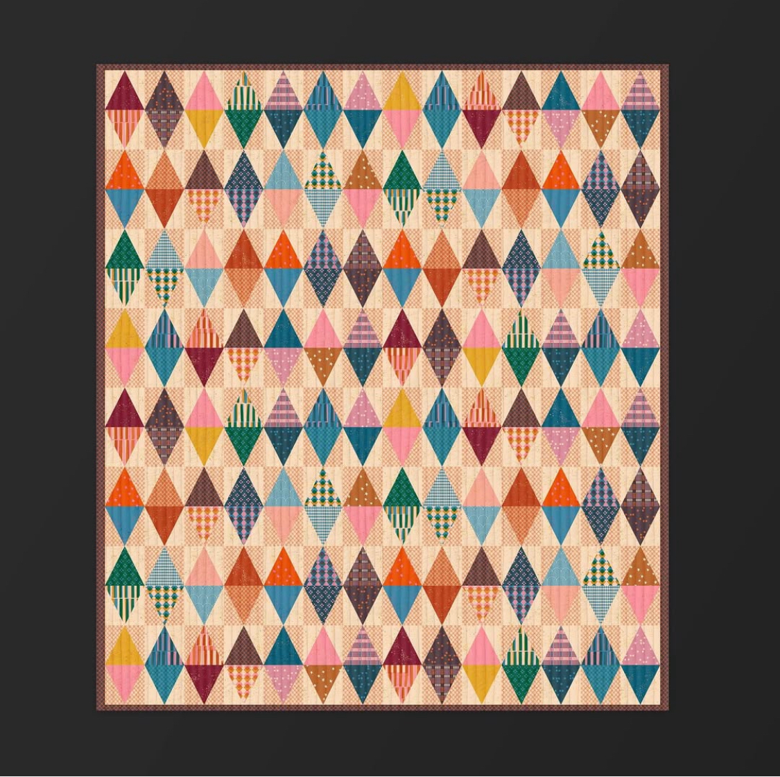
diamonds from ruby star society

i haven't done triangles in a while. this could be fun.

checkerboard by maechen marie

i like this idea of using greens for every other square and then mixing the other colors in for the rest. ooh - i bet i could strip piece it for ease and speed.

a moda "galway" block made by amanda at graccieone

i have to stop now. every time i get into my saved posts on instagram, i want to make about 20 quilts asap! there's just so much inspiration out there, so many good things to make. i want to make all of these ideas whether with these fabrics or not.

i think i'm still leaning toward a log cabin of some sort after all.
what would you make with these fabrics?

Monday, June 16, 2025

serendipitous piles


another online fabric order of fabrics i randomly picked from one shop on etsy that, when arrived, strikes me as a great fabric combination for a quilt.

i love this grouping so much! i think this spontaneous syncopation happens because when i'm scanning a shop for any other items they carry that i might like, i often have certain projects in mind or specific types of fabrics i'm looking for.

backup a bit - i usually find myself shopping for fabric online when i'm on the hunt for a specific fabric i want. either i've seen it somewhere or i need to restock something i didn't have enough of/want more of. i go to etsy and search the desired fabric. when i find it, i also scan the shop for more items i might like because i'm going to be paying shipping as it is and i might as well get a little more fabric in that envelope, right?

so when i'm in this situation, the fabrics i select are going to be influenced by what the shop has to offer/their style, and any projects i might have in mind at the time. also, i am always on the lookout for good low-volume finds and basics/blenders.

considering these factors, i guess it's not really a surprise that the resulting bundle often goes together well. it's happened to me several times. sometimes i have to edit out one or two of the fabrics or add more in if the pattern calls for more, but in general it's really fun to come up with an idea for a seemingly random pile of fabrics that happen to look great together.

i've made a number of quilts from piles of fabric gathered in this way, more than i realized:


this pile of fabrics i purchased from anna maria horner's nashville shop, craft south, on a visit there the weekend she opened the store became a single block, improv log cabin. i was just picking things i liked when shopping at the store. it wasn't until much later at home that i considered that they actually looked good together.

"twelve south" is still in the "to be quilted" queue


this pile of heather ross fabrics was sitting on my pressing table for a long time. i don't remember how it got there, if it came together from a single order (very likely) or if i put the heather rosses from one r a couple order(s) together with the intention of filing them away later. either way, i kept looking at it until i decided to just make a quilt from it.


this is another log cabin quilt (i definitely had my log cabin era), still in the piecing phase.


this golden book-looking pile was a big online order that said, "pretty please keep us together!"


on mother's day weekend 2021 i made them into an aunt bet's by frankie and ray.


in early 2020, i put in an order to fat quarter shop for some yardage of these various solids. the box arrived at my house just as the world shut down and the pandemic kicked off. 


i hadn't ordered these for a particular quilt, just to stock up on some colors i was interested in. but i quickly decided they would be made together in a commemorative quilt, a house quilt i call "shelter in place," to mark the difficult but beautiful time our family spent together in quarantine. i'm still working on this one.


i saw someone else's all-solids christmas tree quilt and decided to use these same fabrics (i had plenty) to make a merry and bright christmas quilt i call "bright forest." status - still piecing.


maybe you recognize this pile from another online order because it recently became a finish. i took out two of these prints (so glad i took out the green sprig print!) and supplemented with a couple more.


i've come to really love "fall paint lake," which now mostly reminds me of our time in malibu while my son was getting medical help in LA. i think of it as our beach house quilt, not a lake quilt. i have no idea where the pattern designer came up with that name. but i can't rename it now. or can i? it still isn't labeled.

that's a look at piles becoming quilts. what should i do with my new pile?

Friday, May 23, 2025

edna fabric edit

choosing fabrics for a quilt is one of my favorite parts of the quilt-making process. it's really fun, but it can be super daunting and discouraging, too. if you add the quilts i've completed with the quilts i have in progess, i've picked fabrics for nearly a hundred quilts by now. i'm no expert, but i've learned by trial-and-error, failures and successes along the way, something about picking fabrics. this post is a detailed look into how i went about the process of choosing fabrics for one quilt.

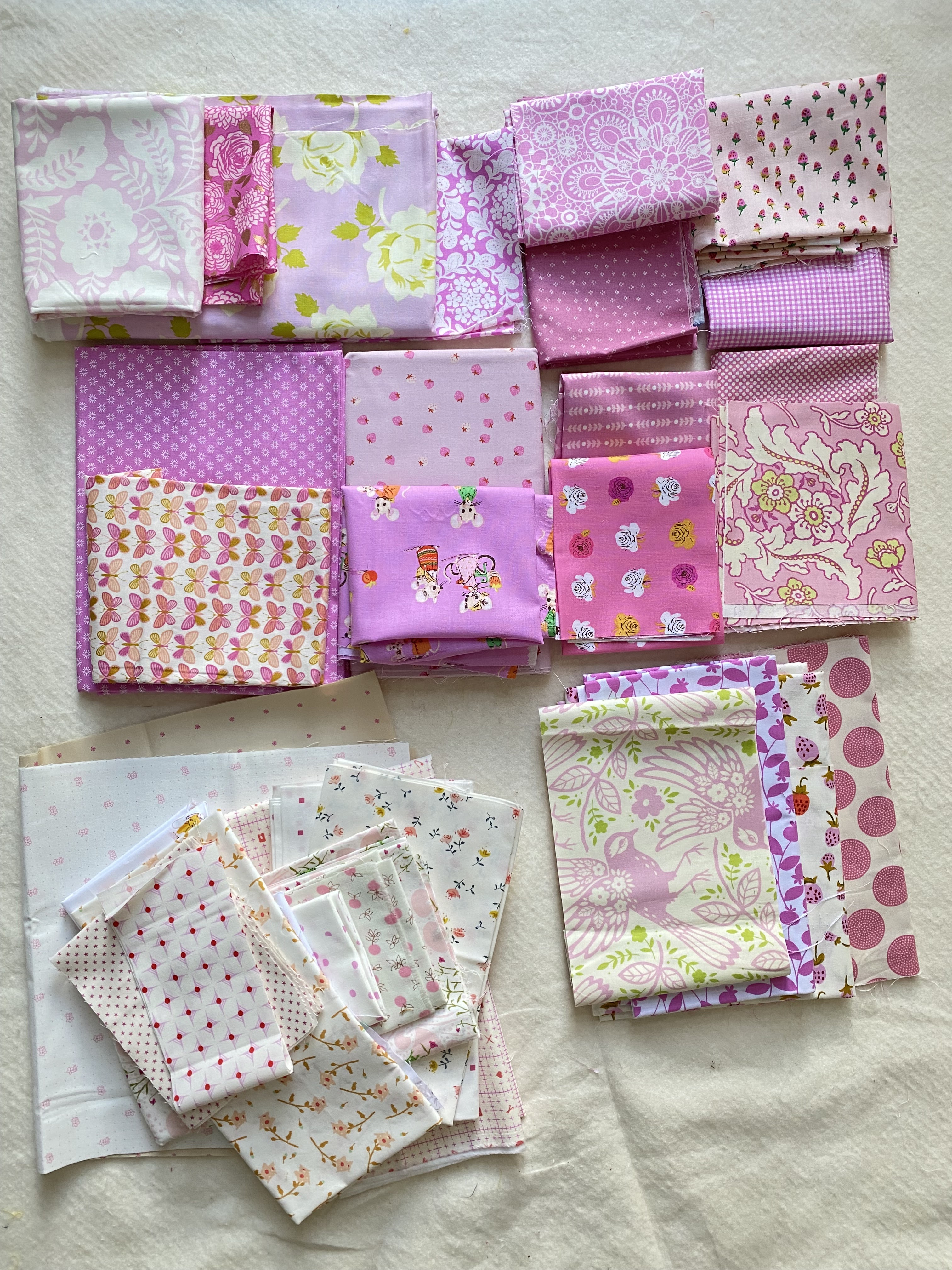
above are my fabric picks for my pinky-purple "edna" quilt. (you can read about my inspiration for the quilt here.) when gathering fabrics for this quilt i went for cool-toned pinks that had a definite purple cast to them, which slid into light purples with a pink overtone. everyone defines colors on the margins differently. my kids and i argue over whether a certain mango color is yellow or orange all the time. so feel free to call these colors whatever you wish! (what would you call them, anyway? i'm curious.)

in this fabric pull, there are a range of pinks and purples in this color-tone family i described, whatever you call them individually. some are more pink and some are definitely light purples. some of the pinks also lean toward bubble gum pink but with that cool tone. i used the photo of amanda's "lyric" quilt as my guide for the range i chose. 

amanda's original pink "lyric"


knowing what to take out of a fabric pull is just as important as what to use in the quilt. these are the fabrics i edited out of the collection. 
  • the top left one is too purple and strong.
  • the adorable desnyse schmidt ditsy print with the pink background had too much of the other colors in it, including the strong blue. in person i don't feel like it reads pink enough. i was sad to leave this one out because i love it so much, but it's not right for the feel of this quilt.
  • i think the two pink monotone prints on the right got cut because i had enough fabrics in that color already and didn't need these two.
  • the two heather bailey prints on the bottom left got culled for their strong secondary color.
  • there were also some low-volumes i culled for similar reasons, but i already put them away 
a square throw "edna" by jennifer jones

"edna" is composed of stars set in a grid of stripes with background squares between. i had to think about which fabrics to use for the stars, whether i wanted to feature them or let them blend in more. i knew the colored prints would be the stripes and the low-volumes would be the background, of course. so what to do about the stars - another color, a solid, what? i didn't have any solids in my stash that were a fit and i wanted to keep the look as close to amanda's quilt as possible.


i decided to use some of the low-volume fabrics that had very strong/large spots of color in them for the stars. there was a whole lot of color in them, so they felt like they'd be too strong for the low-volume sections even though they had white backgrounds. they seemed to be halfway between the other catagories so they would stand out from both sections but still blend with the quilt overall.

there were four fabrics that fell in this category. the rectangle throw has 20 stars, so i'll be using each of these five times.


i came up with 9 sets of the full-colored pinky-purples for the stripes. i'm doing the rectangle throw size (as opposed to the toddler, square throw, twin, full-queen, or king, all of which are included in the pattern), which has four columns and five rows of fabrics. somehow that said to me do 9 sets for the stripes. making them in controlled sets rather than just randomly matching up pairs from the fabrics as i went along seemed easier. and although i want this to look scrappy, i needed a little bit of control in there, too. so sets it is - four for the vertical, five for the horizontal stripes. 

i loosely divided the fabrics into nearly-solid, monotone prints (blenders) and the busier prints, many of which were novelty prints or florals. then i paired them up, trying to have contrast between them (one lighter, one darker - all of which is relative). 


then i paired 16 low-volume fabrics into four sets for my 16 patch background squares. i chose fabrics that had the same range of pinky-purples, but allowed them to be a lot lighter than the colored fabrics and more loosely interpreted. i carefully considered any other secondary colors in the fabrics, too. the country mouse print from heather ross (top left corner) is going to be the loudest block and i'll need to fussy cut for the colors so it's primarily pink showing. i don't have enough of one or two of these fabrics to meet the needs, so i might have to replace them with another fabric entirely or use some of these twice when the need arises. i actually like this so that the quilt won't feel completely matchy-matchy from block-to-block. it's quite common in traditional quilts for the maker to replace a fabric when it runs out, often with something entirely different that was on hand.


i decided to make sets of fabrics for the 16 patches, too, for simplicity. i'm still not sure if i'll assemble all of them exactly the same or not, but putting rows together will be easier than randomly choosing how to place them. i can rotate the rows some if i want to. have some level of pattern when making a scrappy block or quilt really helps production.

to create the row sets, i divided the fabrics into those that had just the one color and those that had other colors, too. that worked out to be about half-and-half. then i put two of each kind in each set, trying to balance the simplest, more graphic prints with the novelty prints. i've already got the bottom set all cut and in assembly. using 42 - 2.5" squares of each fabric is taking up nearly a whole fat quarter per print. that's all i had of the two heather ross novelty prints (butterflies and moons) i'm using for the bottom set, which is why there wasn't any more of them left to photograph with the others. 


there are 42 background squares in the rectangle throw version of "edna." i made a lot more work for myself by choosing to make 42 - 16 patch blocks out of 2.5" squares. that's a whole lot of fabric cutting and patchwork chain piecing coming up!