
choosing fabrics for a quilt is one of my favorite parts of the quilt-making process. it's really fun, but it can be super daunting and discouraging, too. if you add the quilts i've completed with the quilts i have in progess, i've picked fabrics for nearly a hundred quilts by now. i'm no expert, but i've learned by trial-and-error, failures and successes along the way, something about picking fabrics. this post is a detailed look into how i went about the process of choosing fabrics for one quilt.
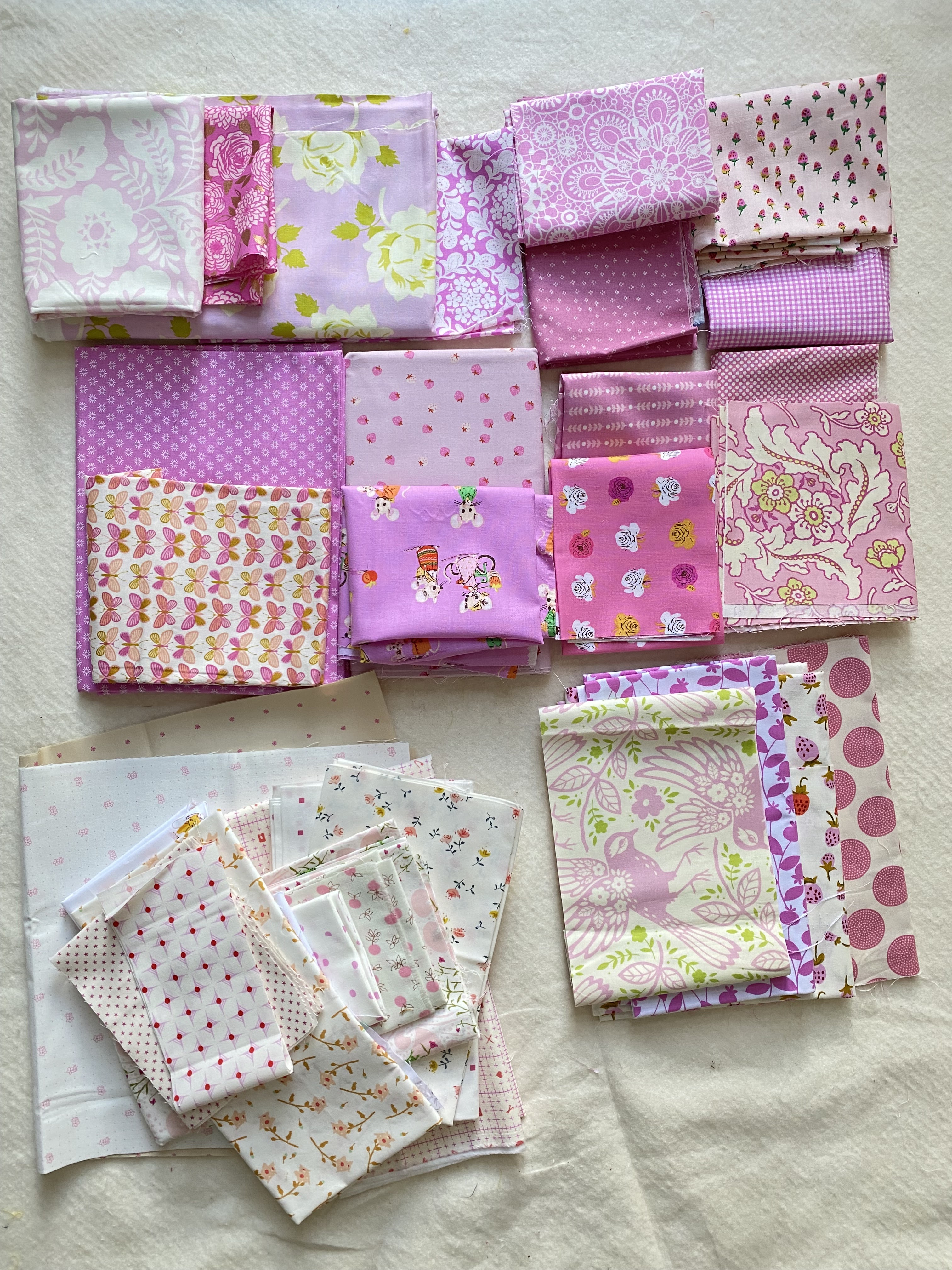
in this fabric pull, there are a range of pinks and purples in this color-tone family i described, whatever you call them individually. some are more pink and some are definitely light purples. some of the pinks also lean toward bubble gum pink but with that cool tone. i used the photo of amanda's "lyric" quilt as my guide for the range i chose.
 |
| amanda's original pink "lyric" |

- the top left one is too purple and strong.
- the adorable desnyse schmidt ditsy print with the pink background had too much of the other colors in it, including the strong blue. in person i don't feel like it reads pink enough. i was sad to leave this one out because i love it so much, but it's not right for the feel of this quilt.
- i think the two pink monotone prints on the right got cut because i had enough fabrics in that color already and didn't need these two.
- the two heather bailey prints on the bottom left got culled for their strong secondary color.
- there were also some low-volumes i culled for similar reasons, but i already put them away
 |
| a square throw "edna" by jennifer jones |
"edna" is composed of stars set in a grid of stripes with background squares between. i had to think about which fabrics to use for the stars, whether i wanted to feature them or let them blend in more. i knew the colored prints would be the stripes and the low-volumes would be the background, of course. so what to do about the stars - another color, a solid, what? i didn't have any solids in my stash that were a fit and i wanted to keep the look as close to amanda's quilt as possible.

i decided to use some of the low-volume fabrics that had very strong/large spots of color in them for the stars. there was a whole lot of color in them, so they felt like they'd be too strong for the low-volume sections even though they had white backgrounds. they seemed to be halfway between the other catagories so they would stand out from both sections but still blend with the quilt overall.
there were four fabrics that fell in this category. the rectangle throw has 20 stars, so i'll be using each of these five times.

i came up with 9 sets of the full-colored pinky-purples for the stripes. i'm doing the rectangle throw size (as opposed to the toddler, square throw, twin, full-queen, or king, all of which are included in the pattern), which has four columns and five rows of fabrics. somehow that said to me do 9 sets for the stripes. making them in controlled sets rather than just randomly matching up pairs from the fabrics as i went along seemed easier. and although i want this to look scrappy, i needed a little bit of control in there, too. so sets it is - four for the vertical, five for the horizontal stripes.
i loosely divided the fabrics into nearly-solid, monotone prints (blenders) and the busier prints, many of which were novelty prints or florals. then i paired them up, trying to have contrast between them (one lighter, one darker - all of which is relative).

then i paired 16 low-volume fabrics into four sets for my 16 patch background squares. i chose fabrics that had the same range of pinky-purples, but allowed them to be a lot lighter than the colored fabrics and more loosely interpreted. i carefully considered any other secondary colors in the fabrics, too. the country mouse print from heather ross (top left corner) is going to be the loudest block and i'll need to fussy cut for the colors so it's primarily pink showing. i don't have enough of one or two of these fabrics to meet the needs, so i might have to replace them with another fabric entirely or use some of these twice when the need arises. i actually like this so that the quilt won't feel completely matchy-matchy from block-to-block. it's quite common in traditional quilts for the maker to replace a fabric when it runs out, often with something entirely different that was on hand.

i decided to make sets of fabrics for the 16 patches, too, for simplicity. i'm still not sure if i'll assemble all of them exactly the same or not, but putting rows together will be easier than randomly choosing how to place them. i can rotate the rows some if i want to. have some level of pattern when making a scrappy block or quilt really helps production.
to create the row sets, i divided the fabrics into those that had just the one color and those that had other colors, too. that worked out to be about half-and-half. then i put two of each kind in each set, trying to balance the simplest, more graphic prints with the novelty prints. i've already got the bottom set all cut and in assembly. using 42 - 2.5" squares of each fabric is taking up nearly a whole fat quarter per print. that's all i had of the two heather ross novelty prints (butterflies and moons) i'm using for the bottom set, which is why there wasn't any more of them left to photograph with the others.

there are 42 background squares in the rectangle throw version of "edna." i made a lot more work for myself by choosing to make 42 - 16 patch blocks out of 2.5" squares. that's a whole lot of fabric cutting and patchwork chain piecing coming up!
This post comes at the perfect time for me. I am going to start pulling fabric for a quilt today and I want to be more intentional about color value. Looking at all of this pink makes me want to make another pink quilt too.
ReplyDeleteInteresting reading. I too, am about to start on a fabric pull using greens, not my colour at all! I wonder if I can follow your lead & be more Interntional about this, I suspect not LOL!
ReplyDelete