Showing posts with label photography. Show all posts

Friday, August 8, 2014

photos that just won't

 so, i know a thing or two about photography. i really do. i have a good camera and a fantastic lens. i use natural light whenever possible and often wait until i can get it to photograph something. i know how to shoot in manual. i adjust my white balance and exposure compensation all the time. i know what aperture means and which way to go when i want more light or depth of field. yeah, i know all that stuff. i aim to take pleasing photos "in camera" and don't edit hardly ever, at all. this works pretty well for me most of the time.

however, i am having a hard time with the latest fabrics i've been using. despite the natural light and adjustments, they just don't look good. whenever i take a detail shot, i end up with what looks like a terrible flash photograph. just look at the ugly pictures i got when shooting in the lovely location above:

white balance - shade; too yellow

white balance - sunlight; slightly grey

white balance - sunlight, exposure adjusted +1 for more light; washed out and colors too bright
 and what happens on the design wall is even worse. i really do try to square myself with what i'm shooting, but it's difficult in the room with the table in the middle of everything taking up all the space. i stand behind it or on it when necessary.

  i tried to get a shot of part of the quilt on the design wall in natural afternoon light. it looks like a nasty indoor flash photo to me. is it that the intense colors in this quilt are difficult to photograph or is it me? the reds, in particular, are always off. and i either get slightly grey photos with not enough light in the whites or nice bright whites but the other colors are too intense and/or washed out.

here's the setting where i'm shooting the design wall photos, all natural light only:

white balance - shade; too yellow
 btw, my walls are a buttery yellow color, best captured on the left behind the ironing board in the above photo.

white balance - daylight; greyish, especially in the whites.

white balance - daylight, adjust exposure +1 for more light; washed out and colors are lurid
i know all our screens won't be synced, so this may come across differently from where you sit, but maybe you see what i'm talking about. any suggestions?

fyi - i shoot with a canon 60d body,and canon ef 24-70mm 2.8 apt ultrasonic L series zoom lens.

Wednesday, December 18, 2013

how not to shoot a flimsy

 along side of working with my youngest scholars, i got the top for "bandwidth" completed. the top being done, the flimsy needed to be documented and shared. but all i had to help me photograph it was two short children and a porch swing. this is apparently a very long top because even with the aid of the two short children (they are actually tall for their ages), and the porch swing, they couldn't get it fully off the ground.

also willing to help was one toddler . . .

 . . . and three curious dogs.

we used to have just one completely obnoxious pharaoh hound, but whilst away at disneyland with teenagers over the weekend, the babysitter let two stray chihuahua adolescents in the house. we've been unable to locate the owners yet and aren't heartless enough to boot them back out in the cold, as much as we'd like to . still hoping for a Christmas miracle for them and us.

even with the unwanted helpers out of the way, this was as close as i got to a shot of the new flimsy. the colors are washed out on the top (but the citrus tree looks great!). i'll aim for a more technically accurate photo once i have the quilt completed.

as anticipated, the addition of the large solid panels really calmed down the high energy of all those print strip sections. for the record, i chose the slightly deeper, less-flat blue. i'm liking the results just fine.

now i need to make three backing and baste some sandwiches!

Friday, October 4, 2013

september quilt photography workshop challenge

frustration

things that make me laugh - or a typical day
(this is both right now)
i'm linking in with beth's photo challenge at plum and june again this month. i have to say this one was harder for me. most likely that's just because it took more forethought and i just didn't feel up to that this month. we were supposed to use her word phrase prompts to inspire a photo composition. that had me stumped for the most part. but then a few situations came up that provided opportunities so i get to link up after all. we're not supposed to write any explanations (egad - i have to hold back my tongue!) but just supply the phrase the photo matches. i've kept to the rules. however, the story of sewing my slider to my quilt will be told later in another post. it's too good not to share the laughs.

Thursday, August 29, 2013

the light of liberty

#1 - P  tungsten light  1/80  2.8f  +2/3 exp  iso200
this is a photo shoot process post. it's heavy on photos (28) and words, too, to describe my thinking. you've been warned! i've linked in with plum and june's photography workshop party. this is a more technical post. i also wrote a basic, entry-level photography post here.

while admiring beth's mini summer quilts at plum and june, i realized briar rose was now available and i didn't have any yet. yikes! even though i'm trying to fabric diet, i hopped on over to fabric.com to get some. however, as darling as the line is and as much as i adore heather ross's designs, i decided i could live without a lot of briar rose. my willpower kicked in and i only selected two prints to coordinate with the pile i already have set aside from previous lines. whew! i patted myself on the back for being so good.

then, . . .
for some reason, i checked to see what liberty of london lines might be available. uh oh! lots of new tana lawns. that's where the willpower (mostly) flew out the window. i ordered 5 - 1/2 yard cuts of some irresistible prints. oh, shame on me! why, oh why does that stuff have to be so expensive? and gorgeous and completely irresistible to me? utter temptation.

#4 - P  tungsten  1/80  f2.8  +2/3exp  iso160
well, the whole caboodle arrived yesterday afternoon during our family cleaning hour. i didn't have time to look at it, so i set it aside, forgetting it until this morning. the dog woke me up at the crack of dawn, so i had some quiet time to myself. i got to sit down with my new lovelies and just admire them to my heart's content. they truly are exquisite. i can't help repeatedly running my fingers over their silky texture. and the colors! the dainty florals are my favorites. something about the delicate line drawn flowers appeals to me.

ah, it was a special time for just the two of us this morning. ha, ha!

M daylight  1/100  f4.0  iso200
as i caressed my darlings, i looked up at the entryway and noticed the amazing morning light shining through. i have these large wicker baskets lining the entry; one for each child to keep their shoes and such in. the sunlight streams through the window in the morning, setting the golden baskets aglow in such a lovely way. it reminded me of laura's photo shoot post. and liberty reminds me of laura. suddenly i wanted to combine the fabric with the baskets and light. it seemed a perfect match.

M  daylight  1/100 f4  iso200
i zoomed in a bit to try and capture how the light gleams on the basket handles and the dust motes dance in the air
it turned out much tougher than i had anticipated. having two different aspects i wanted to include really complicated the matter. i could get one or the other, but featuring both together proved illusive. i think i asked too much of the photo. in truth, none of the photos capture the details of the fabric designs enough for me. still, it was fun playing and working on my skills.

i took 50 photos, but only included 28 here.

M  daylight  1/100  f4  iso200
closer still on those handles - i still didn't capture the magic light, though
the very first photo in this post (#1) is the first one i took. and i do like it. but it doesn't showcase the fabrics as much as i wanted to. the yellow print, my favorite, is out of focus thanks to the shallow depth of field i got with my 2.8 f stop.

 i tried putting the fabrics in a row on the backside of the basket so they would all be in equal focus:

#2 - P tungsten 1/60  2.8f  +2/3exp  iso160
but to get the basket included, i was too zoomed out.

i zoomed in, including only a bit of the basket:

#3 - P  tungsten  1/60  2.8f +2/3exp  iso160
 but i lost the points where the basket was lit up and sort of sparkly in the bright light.
 i also tried the angle in the 2nd photo of the post (#4). that one looks rather like dishtowels in a basket. i was trying to include a bit more of the basket, but i don't like the way the handle covers the fabrics.

at this point, i was frustrated with the styling, so i went back to where the light sparkles on the handles. i placed the fabrics slightly differently and tried again:

#5 - P  tungsten  1/8  2.8f  +2/3exp  iso125
the aqua capel in the back is still too blurry. and the handles are dead center; i prefer off centered.

i was shooting in P (program) mode, letting the camera pick my settings, but with the exposure compensation bumped up for more light. it was tricky because i didn't want to totally blow out the handles yet the fabrics still needed to be bright enough.

while looking at my settings, i noticed the white balance was set to "tungsten light", which is for light bulbs. oops. i switched to that last night while photographing something else indoors sans flash.
#6 - P  daylight  1/80  2.8f  +2/3  iso125
 hey, that's a lot warmer looking! more of the golden quality of the light shows. but you still can't see all the lovely fabrics clearly. and the whites are less crisp from here on out with the white balance shift. it's a choice of what to sacrifice.

i moved the fabrics again to get them closer together:
#7 - P  daylight  1/123  f2.8  +1 1/3  iso 125
still not happy about the blur. i decided to go completely manual so i could move the aperture setting and still control everything else. what the heck.

there was a lot to think about as i was not only trying to find good styling but the proper settings. sometimes one or the other is sorta taken care of for you and you can concentrate on one. otherwise, you have to keep switching your mental focus. it's a fun challenge and brain exercise.
#8 - M  daylight  1/100  f4  iso200
i opened up the f stop a little so more of the photo would be in focus. however, it was still pretty shallow and because i focused on the fabric in back, the front two are still blurred. it's a nice shot of that pretty june's meadow in yellow/white, though.


#9 - M  daylight  1/100  f4  iso200
i framed this one a bit differently, but was still having depth of field issues.


so i went back to the laundry look at the back of the basket:
#10 - M  daylight  1/100  f4  iso200
 the light coming in the window was shifting all this time, as light will do. now i had serious contrast issues going on. yuck. the fabric is not bright enough and the basket is too bright. also, that draping looks sloppy.

i tried a couple and gave up. instead, i lined them up along the handle side and moved around so i could shoot more straight on:
#11 - M  daylight  1/100  f4  iso200
 argh - photo bomber! the toddler was up at this point and adding yet another aspect to my mental calculations.

remove baby, shift frame slightly:
#12 - M  daylight  1/100  f4  iso200
 getting better but i wanted more light to brighten the fabrics.

 i moved the shutter speed number higher:
#13 - M  daylight  1/200  f4  iso200
 dang. that was the wrong way! shutter speed numbers need to get lower for more light, aperture numbers go up. so much to remember.

#14 - M  daylight  1/60  f4  iso200
 ooh, i like this exposure! very pretty.

i got that angle down and decided to attempt the laundry shot again:
#15 - M  daylight  1/60  f4  iso200

#16 - M  daylight  1/60  f4  iso200
although i like the way the light bounces around here, it's just not what i was going for with the picture story.

what you can't see happening in all these shots is this:
M  daylight  1/60  f4  iso200
  . . . my cute little assistant. she was continually trying to replace my lens cap (bugs her when it's off) or style fabric for me or climb on my head.


because the light had moved, i decided to move the basket itself. also, i had two more liberty prints i wanted to photograph. in the interest of time, i added the darks to the lights for a complete group shot. the aperture/f stop got changed, too, for more light.
#17 - M  daylight  1/60  f2.8  iso200
 that need to balance the light on the baskets and the exposure on the fabric was a problem again - i don't like either here. the fabrics definitely needed more light and to all be in focus (more depth of field).

so i closed the aperture down to f4 (greater depth of field) and had to switch my iso higher so i could still hand hold the camera and not get any shake. if i had moved the shutter speed, i wouldn't have been able to hold the camera still enough. most experts say don't hand hold below 1/120, but i have a steady hand and feel comfortable taking it to 1/60. i'll actually even attempt lower if it's not a vitally important shot or i don't have an option.

#18 - M  daylight  1/60  f4  iso400
 now, this looks a tad too bright here on the dark teal mitsi at the left and also on the yellow june's meadow. but i like it on all the other fabrics.

and here, when writing the post, i noticed something important. the above shot looked perfectly exposed and pretty sharp on my camera's little lcd screen but less so on the computer. i think one major reason for this difference, besides size, is that on the camera the shot is surrounded by black, which makes it pop more, and here it's encompassed by white, which is dulling it slightly. that's something to keep in mind when shooting, i guess.

i tried one last angle on this styling to see how it looked. in order to not cut the fabrics off at the bottom but not have to include so much empty space at the top, i went vertical:
#19 - M  daylight  1/60  f2.8  iso400
 again, what you can't see is the way i'm laying on the floor to get this shot. but i couldn't lay flat on my back, i had to be raised a smidge to get the right angle. this was tricky enough photo yoga without the baby involved, she made it near impossible.

#20 - M  daylight  1/60  f2.8  iso400
 angle improved, the fabrics looks wrong.

i tried draping them and going horizontal again:
#21 - M  daylight  1/60  f2.8  iso400
 all that empty space on the right bothered me. i added a 2nd basket to fill it:
#22 - M  daylight  1/60  f2.8  iso400
 that blocked my light and looked dumb.

i removed the basket, placed the fabrics closer together, returned to vertical orientation:
#23 - M  daylight  1/60  f2.8  iso400
 oh, almost! the aqua capel looks yucky.

redrape the capel, crop in a tad, shift frame a touch :
#24 - M  daylight  1/60  f2.8  iso400
fabrics, l to r: emma and georgina in teal/dl blue; capel in aqua/wh; June's meadow in yellow/wh; floral fusion wh/yl/pnk;
misti  in dark teal

well, the light must have changed again because this is a bit lighter and i didn't adjust any settings!

everyone was awake and breakfast needed to be made at this point, so play time was over. i had to put my camera and pretties away.

if you actually read all that, or even just skimmed down to the bottom, which one do you like best? and why?

now i get the fun of deciding what to do with these darlings! it has to be perfect. i'm blank on ideas so far.

Sunday, August 25, 2013

photography or quilting = happy me

at work on a photo shoot in early august
i hesitate to post this today because 1) my photos are solid, but not the best by a long shot, 2) my people and life photography are better than my sewing photography, 3) i didn't have time to take the photos i would have liked to to go along with the post or to write it as well as i'd prefer. but here's what I've got to share. i hope it helps someone somewhere.

 i have been a hobby photographer for about 15 years. i got my first slr camera in 2000 and made the switch to digital in 2008. this was later than most because i wasn't satisfied with the quality of digital til that time. currently, I shoot with a canon 60d, usually with my 2.8/24-70mm zoom lens. i've read dozens of books, taken some real-time workshops from professionals and at least two online courses, too. i've also taught basic photography classes to mom groups a few times.

i love photography!
and making pretty pictures.


in order to not bore with a bunch of words, this post will be interspersed with photos i took recently on our big road trip as well as fabric and sewing shots. warning: it's a big post.
tour boat on san juan island, wa

although i shoot daily and have done infant portraits and a few family sessions (as well as one engagement shoot - yikes!), i am NOT a professional photographer. in fact, being asked to do photography for others makes me super nervous! i just really like learning about photography and making the best photos i can in-camera at the time i take them. capturing my world and experiences makes me happy.

i'm a homeschooling mom of 7 who also likes to read, scrapbook, and quilt. i do NOT want to spend my time editing photos. therefore, i do my best to shoot well-lit and cropped photos when i take them. and i live with what i get. an imperfect photo often captures enough of what i want to some degree. i'm okay with that.
the backlighting in this photo made it rather hazy and faded, which can be corrected with editing. but i like it fine the way it is.

the opening photo in this post was taken by my friend's daughter while i was consulting with jen about the shots i got of her and her husband. jen, a college roommate and my bestest old friend, talked me into doing a last-minute family session for her while visiting them in Washington state this summer. her idea, NOT mine!

this is a photo i took of two of my girls after that shoot on the beautiful Puget Sound. it's a tiny bit dark, but good enough for me, especially since i was able to capture the colors in the sunset sky by adjusting my white balance! that's a feature I've been messing with the last few months and i am happy with the improvements mastering it is bringing.

my kids playing on the private beach of the house we rented on san juan island

i learned how to shoot in manual mode a few years back and am fairly competent in it. i definitely understand the workings and interplay of iso, aperture, and shutter speed. however, i find that shooting candids of children/moving targets does not usually allow for time to work in manual. so most often i shoot in P (program), which is sort of like auto but allows me to make adjustments.

my go-to adjustment is the exposure compensation. i use it to quickly bump up or down the amount of light coming in the camera's auto settings. this works quite well for me most of the time. if i'm not happy with what i'm getting that way, then i go manual.

bakery stop in canon beach, or


when i started blogging about my sewing and began shooting more things rather than people, i quickly realized my product photography needs help! i keep my eyes peeled and take note of other sewers photographs and look at styling in craft books for ideas on how to improve.

bear d1 made 2 yrs ago - acceptable, but needs better exposure and less distracting background

desk of merriweather lewis at fort clatsop, or

i know my photos are not the best out there. however, i'm satisfied with the quality of them and that's what's important. like i said, i'm happy with imperfect photos and i'll post them if they're all i have. but there are three basic things i learned a long time ago that can improve any photography with any camera tremendously. i'll share those today and maybe some more complicated tips another day.

1. shoot your subject and leave out the rest

most untrained people, when handed a camera, will center their subject in the frame and leave as much room around it as possible. you don't want to cut anyones head off - i get it. (my grandfather was 6'4", that happened to him a lot in group photos.) but what that can do is give you a shot like this:


when what you wanted and were thinking of when you took the photo was this:


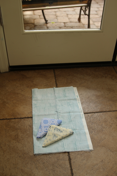
so think about what you want to photograph, the story this photo is to tell, and then include only that in your photo. in my sample photos, the story i wanted to tell was "fabric i got at a certain shop." the top photo is "some fabric i bought, my tile floor, my courtyard door." the second photo captures much more closely what i was trying to show.

get in close. fill your frame with your subject as much as possible. maybe even cut off a bit of it.
 in this photo, i put my fabric pile on a plate for styling, but to include the entire plate, i had to include a lot of wall space and dusty cabinet top also. not a very effective photo.

this zoomed in photo still includes some of the pretty plate for styling purposes, but cuts off part of the plate and even the fabric, which showcases the fabric even better.

now if you want an atmospheric shot and the setting is part of the story you are trying to tell, then include the entire setting in your photo. but if not, then zoom in on your subject and leave the setting out.

case in point - the top photo of the fabric on my floor in front of the door was actually taken to show where i was shooting so as to demonstrate shooting in natural light. that's the story that photo tells. but i didn't include the whole hallway or entire door, just enough to give you the idea.

zoom in close. then closer still.
don't forget that sometimes the zoom is you not just your lens. move yourself.
this photo tells the story of my daughter playing in the water in the bay.

i love how this photo captures the seaweed muck on their feet
and the second photo captures a detail of the story i wanted to tell. maybe you can see the seaweed in the top photo, maybe not. i made sure to get a shot of both parts of the story.

2. try different angles and perspectives


lavender farm san juan island, wa

i've been known to lay on the sidewalk or climb on a fence to change my angle when taking photos. walk around, move yourself, try out different sides, get higher or lower. by playing around with perspective you can change your photos dramatically. and often you can crop out background distractions by moving yourself rather than your subject, which isn't always possible.

here are two photos that are not at all great, either one of them, but one is much better than the other just because it's oriented differently.
awkward! ugh.

still somewhat awkward, but better
standing directly over your subject, on a chair if necessary, can really help give you a flatter photo. it sure would help with the strangely angled one we all get of our quilts on the floor sometimes. (I've posted plenty of those - see above.)
taken standing in front of the table the blocks were on
taken standing directly over the blocks, shooting down

3. take lots of photos
photo #1 - fabric pull for new nephew's quilt

photo #2 - added a bit more light
 i already mentioned this, but it deserves it's own place in the list. if you're playing with cropping and angles, you are naturally going to shoot more. but i'm saying it again to be clear.

photo #3 - tried shooting from the top to see pile better, but it shows the top too much


photo #4 - shifted angle and tried adding light; too much
photo #5 - better light, but i'm not liking this angle

in the days of film photography, you had to shoot blindly and hope it was working out. film and development cost $$$. digital doesn't work that way! you get to see (mostly) how your shots are coming out and you can erase what you don't like. memory cards are super cheap compared to film and can be reused many times. the storage capacity on them these days is enormous.
photo #6 - restyled pile by fanning out and stood over for another angle


photo #7 - new angle on fanned pile
so click, click, click away!
don't be stingy.
just make sure you download often or carry extra memory.

photo #8 - shot from top again, zoomed in a bit

photo #9 - added some light


photo #10 - restyled again in a pinwheel, off centered


photo #11 - one more shot! but i like #10 best because i cropped just a little better

sometimes the first photo of the 6 or more identical shots i took works the best, but usually not. and if you're photographing people, the more you have in the group, the more you need to shoot to increase your odds of that one great shot.

 you also have to learn how to use that trash can button a lot so you don't end up with photos you don't need clogging your storage. be ruthless! take a lot, then get rid of what doesn't work or isn't the best.

here's the bonus tip:

4. turn off that flash & learn to use natural light!

this is an entire subject unto itself, beyond the scope of my post. but after you've started playing with the above 3 tips, it's going to make night-and-day difference in your photos. there are limitless resources dealing with this subject. look it up and figure it out. you won't regret it.

this post was inspired by beth's new photography workshop link up at plum and june.