my
"indian blanket" quilt is still looking cheery on my design wall, but i'd like to get it off there eventually. however, i've had lots of other projects prioritized above it lately, including a few finishes. my other hangup has been i couldn't decide what to do with my next row. this particular row has a mix of 4" and 8" triangles in three colors. the fabrics above are the ones i had originally slated for the row. but when i was cutting, the two low volume prints (smaller triangles) just didn't seem to have enough contrast between them. i decided this after i'd cut all the darn triangles.
so i dug around and looked everywhere for a solution. a box containing some "folksong" had just arrived on my doorstep and this coloring garden print seemed to have all the right colors in it. except that pinky-purple background color wasn't right. also, it was too similar to my larger "focus" print, the peachy background floral print. again, after cutting everything, i made the choice to try again.
this soft pink from "color me happy" had all the other right colors and was a good choice for contrast in scale, but the pink was too clashy. again, decided after cutting. boy do i have a lot of cut triangles now. fortunately, i think i can use them for different rows in the quilt. just not this one.
at this point, i had tried everything i had at home that might remotely work.
so that meant a trip to the store.
i found four different prints from joel dewberry's "bungalow" line, which all had the right colors. i got a 1/4 yard of each, knowing this would be a decision to be made at home. one got nixed for being too dark and the other two were nixed for scale. in the end, the wavy, funky dot print gave me what i was looking for.
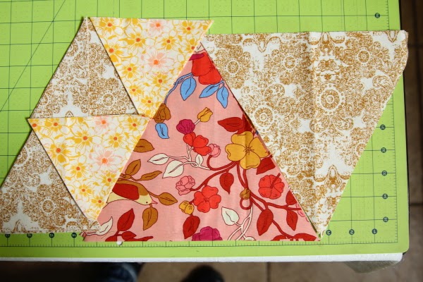
here's an in-progress shot of how it's looking so far. (i wish you could have seen me standing on top of the dining table to take this photo from above so as to make it flat.)
this might seem like a tedious post, but i thought it might be helpful for someone else to see the selection process i went through. having learned about contrast in scale and color value helped me the most when making this choice. even a small vocabulary of words to guide an otherwise somewhat intuitive thought process really does help me make choices.
linking up with lee's
wip wednesday at freshly pieced.


This is looking great! Thanks for sharing your process.
ReplyDeleteI love your color choices. It makes me want to curl up under it in a pretty green field and read a book!
ReplyDeleteI love your color choices. It makes me want to curl up under it in a pretty green field and read a book!
ReplyDeleteIt's looking really good now... worth going thru' the selection process! I enjoyed reading about how you got there! Linda
ReplyDeleteI love your final choice - as soon as I saw the pic I said "that's the one". :) I enjoyed seeing all your choices and how you reached your final decision.
ReplyDelete