Showing posts with label finish. Show all posts

Sunday, March 22, 2026

cheery (easter) quilt, a finish


my eternal spring break handstitching project, which has accompanied me on the last five spring break trips, is actually finished!


the quilt adorned the couch in the bedroom i stayed in, which is also where i stitched on it. there was a full wall of windows looking out on the view of the costa rican jungle and ocean in the distance. i think the brightly-colored boxes of the quilt looked right at home in the modern decor with the tropical view.


i actually finished off the handquilting about halfway through the trip this year, for once underestimating how much i would be able to complete, and was left twiddling my thumbs during downtime when i'd have been happy to be stitching and had none to do. 


here i am, about to complete the last box of handstitching. on this extra-thick blue section i decided to do two sets of stitches on the inner and outer borders of the frame. i considered doing several rounds to fill the frame width completely, but liked the look of just two on each side.

another design switch i made was i opted not to handquilt the hot pink frames. i've never been happy with the thread color i got for this color, so i decided to leave them unstitched. i feel like this was a good choice.


the sun was going down as i finished up. what a spectacular setting to be handquilting in!


after being taken on five international trips. this quilt was ready for a wash. at the beginning of the trip i was a little anxious i wouldn't finish it this time because i knew it shouldn't go any longer without getting cleaned up and i didn't want to wash it before i finished the stitching because that would definitely affect the look of the stiches that came after washing. but i got it done and all is well. as soon as we got home after more than 10 hours of travel, i threw it in the washer, and put it in the dryer just before going to bed.

just look at how fabulous the handstitching looks after being washed! it takes the quilt to the next level, in my opinion, and i love it so much. i'm one very pleased quilter. sticking it out over five years to complete all the stitching was absolutely the right choice. i've been rather ambivalent about the quilt for a long time, but now it's done and washed, i truly love it.


now we're home, i've had it casually draped on the bed in this window so i can frequently look at the crinkle and smile.


this is how the double rows of stitching on the big blue section looked. love it. there were two other frames in different blocks that were also wide that i would have added the second row to, as well, but i didn't have the other colors with me on the trip because i'd already completed those sections. oh, well. this one corner is extra nice.


the back shows off the handquilting really well. again, i'm just so pleased with how this turned out. i thought all the different colored threads would show up against the mostly solid curry backing, but the stitches are so small on the back that the colors don't show as i imagined. however, the look of all the stitches is quite impressive, so i'm happy with the outcome.

this has me excited to do my next color box quilt when i get my wips finished and get back to starting new projects. all in good time!


the binding is a darker cinnamon brown from the top. i think it frames the bright colors well. the post-wash crinkle on it is another textural hit.

i did a beach photo shoot with this quilt in mexico, where we normally spend our spring breaks, a couple of years ago when i got the sun stitched into the top. too bad the crinkle isn't in those photos; these will have to do for crinkle and those show the full quilt.


that's a wrap! the cheery quilt that d4 told me looks like easter colors is now ready for easter season, spreading its sushine in my heart if nowhere else. 

Saturday, November 22, 2025

grellow garden geese, a finish


"grellow garden geese," my second fall quilt finish is washed, stocked in the family quilt basket, and in use. i've been waiting for the fall colors to come in around here for a nice outdoor photo, which would show it to best advantage. but those colors are not here yet and i've settled for a basic bedroom photo set.


this quilt was a chance for me to practice flying geese and use some fabrics i wasn't so chuffed about. it's low-stakes, for sure. early on in my quilting, i bought a half yard set of these "origins" fabrics by basic grey for moda after seeing a quilt made from them that i liked well enough, but did not love. a decade later i decided to mix in some solids and coordinating fabrics to see if i could make something i liked. the verdict: meh. kind of. it's fine. but other people around here like it a lot. i think i just need to reconcile myself to the mellow color palette. it's not what i would normally choose to make but it does have it's pleasant aspects.

i split the fabric collection in two, separating the cool-toned fabrics from the warmer ones. this is the warmer collection. i used the multi-colored floral in the photo above as a guide for what other colors to add in the mix. it was feeling a little drab with just the yellows and grellows, so i added some of the brown tones from the floral for more warmth and contrast. i left out the aloe colors because they are in the other set. i hoped the yellows, grellows, and browns would do well together.

in the floral, the browns are small touches of accent color. in the quilt, they are of equal size to the other pieces and cast quite a different effect on the whole. i called the quilt "grellow garden geese" because, originally, the grellow was the strongest color. and i like the alliteration. but with the warm browns added in such quantities, its more like "spiced grellow garden geese" in the end. ah, well. i did lean heavily grellow on the back trying to redeem the name and it's sticking.


the quilting is wide-spaced, horizontal, straight-line quilting in a golden yellow color.


the binding is another fabric from my early quilting days, the popular and pretty "henna garden" from sandi henderson. i was liking the browns in the quilt when it came time to bind it and thought it would make a nice edge to the quilt. i think working on the quilt during the fall season heavily influenced this leaning towards the browns.


somewhere along the way in my making of all the geese, i made two different sizes. the smaller ones were 1/2" smaller than the others. i simplified things by putting the two sizes in separate rows. this resulted in rows that don't match across the seams, but it's not distracting at all. quilters just make do, right?

everyone else in the house seems to like this one and i'm satisfied with it. some of our makes we really love and some we just like. that's okay. i think i do like this quilt better than if i had used the whole collection together. it taught me more about what i like and don't, and it gave me a lot of practice making flying geese. that's not wasted.

Monday, May 12, 2025

citrus season, a finish


"citrus season" is a finish! 

well, it still needs a few threads buried (there were a whole lot) and a wash, but that'll happen shortly when we get home.


ever since i started this quilt, i've wanted to photograph it with my own mini citrus orchard at home. but here we are with it all finished up and a lovely lemon orchard about 20 minutes from our rental in malibu. i think it worked out nicely.


d5 and i were going inland one last time before we leave and i brought along two quilts to photograph in the beautiful farm settings just down the coast and around the mountains.

we had a lot of wind, which makes shooting so hard. but the spot was nice. i've passed this orchard several times in the last 6 weeks and knew i wanted to bring this quilt here when it was done. the lemons were ripe and the blossoms just starting.

d5 said it smelled like our backyard at home when we got in among the trees. my sniffer isn't as keen as hers, but i did get a whiff of the blossoms periodically and there's no better scent in the world. there were ripe lemons scattered on the ground everywhere, which made cheerful pops of color in person (less visible in the photos). d5 told me to get them in the pictures and i did try.


this quilt is a healthy 60"x72" size, which can be quite hard to hold up, especially for two gals sized 5'5'' and 5'3". add in the wind and shifting sun for a challenge. i think they turned out nicely. 


lemon tree very pretty

and the lemon flower is sweet

but the fruit of the poor lemon

is impossible to eat

well, that's what honey and sugar are for. i love that old peter, paul, and mary song! it goes deep into my childhood. but i never bought into the idea that love was like a lemon. and my grandson loves to eat lemons, so i guess not everyone agrees about the fruit's impossibility, either.


here's a closer look at the echo quilting i did on all the major seams to form an on-point (diamond) grid pattern. i really like the big stitch effect of using thick, chunky auriful 12wt thread on these giant star quilts. it adds a little texture and depth to an otherwise simple quilt.


this quilt rings more orange than lemon, but we took what we could get and i love it.


this was a fun mini adventure for us two. i think d5 is always going to remember our quilt shoots together. she's not always eager or excited, but she does get into it and has some great ideas for me sometimes. 


because of the side of the orchard i parked on, we had to hop this steep dirt ditch to get to the trees. nimble rock climber that she is, d5 had no problems. i was ... less nimble, but i made it. getting back across was harder! oh, the things we do for our quilt photos.

details

size: 60" x 72"

fabrics: kona and moda solids for the top, stash prints for the backing

pattern: stella grande, my design, with piano key border

machine quilting: echo quilting of seams in grid pattern in auriful 12wt, 2021

binding: moda bella solids in clementine

*click links to see details up close

Saturday, May 10, 2025

wiltshire rows, a finish


when i was a child growing up on the southwestern outskirts of houston, tx, we would pass cotton fields on the way to church. i loved watching the effect of the rows whizzing by as we passed in the car. later, in high school in the nashville, tn, area, the fields were most often tobacco or corn, but the effect was the same. 

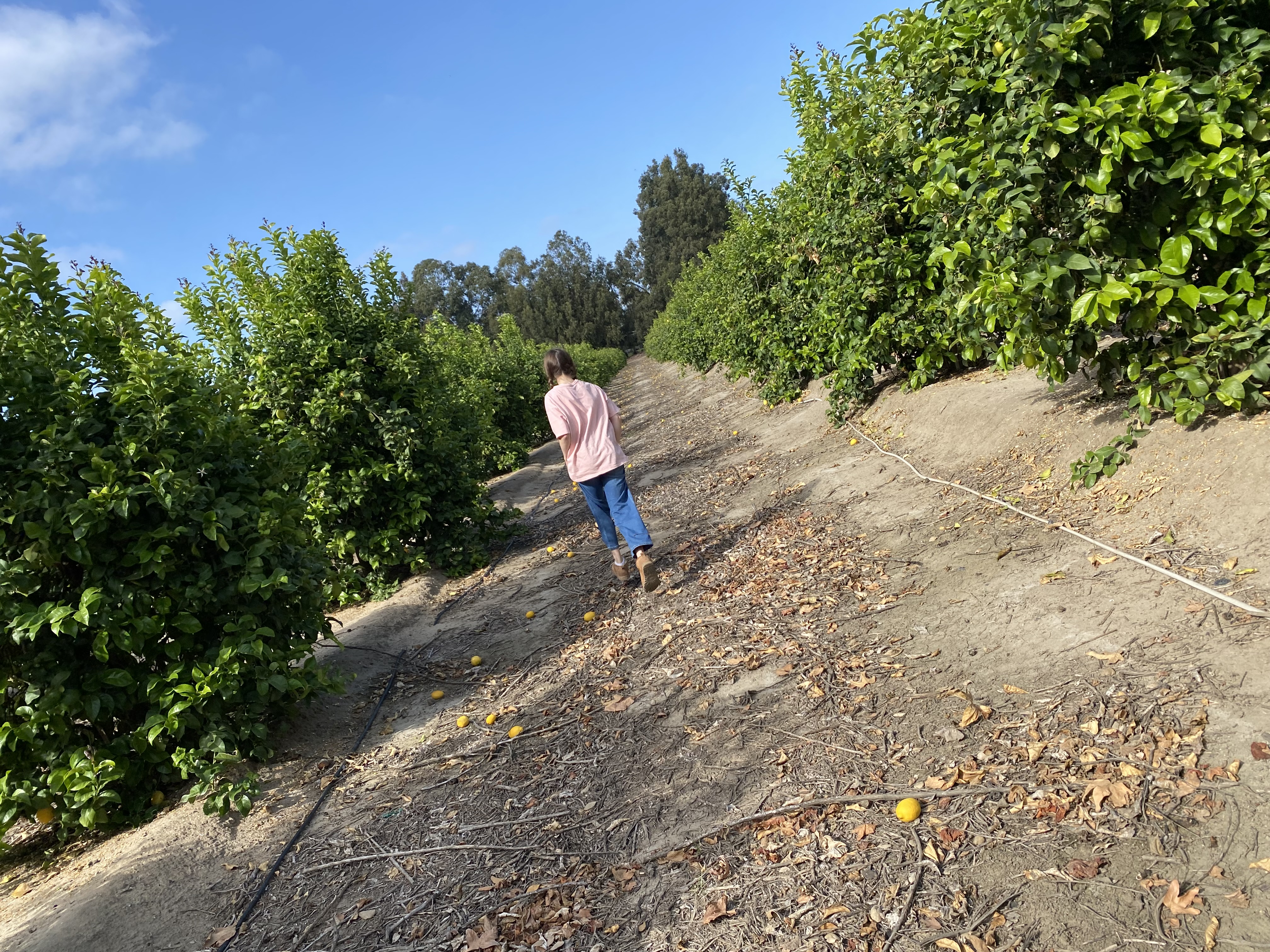
since we've been staying in so cal, we see massive fields of all types whenever we go inland up the coast. witlshire rows, one of the quilts i brought here with me to finish, has always made me think of rows of crops, so i knew i wanted to take some finish photos with it in some of these farm fields. i wanted to use the strawberry fields the most, but those have recently been picked.


as i've passed the various fields on my inland shopping excursions, i looked for some with the correct row orientation for my desired shots. most didn't line up with what i wanted - no one consulted me when planting their fields, haha.

this patch of kale has the santa monica mountains behind it and was an acceptable pick. but d5 didn't want to step very far in, which would have looked better. the plants were up to her knees and she didn't want to wade through too many.


the day we shot the photos was the first sunny day in a week, but it was also windy! i always forget to factor that in. we got a lot of body-hugging or crumpled, whipping quilt shots. she was not in the photo shoot mood yet (i sprung it on her) and we moved on quickly. because we had some errands to run beforei had to drop her off at a church activity.


but as i was driving along the dirt road bordering the highway to get back on, i saw this leafy patch of greens and decided to try once more. i thought maybe the shorter plants would be easier to hold the quilt in and the rows would show up more. and it worked!

we've passed these fields a lot and i could never tell what the crop was. not even my farmboy husband recognized it from the road. but as soon as we got out of the car, the intense scent told us exactly what it was - celery!

this is more the type of shot i had been imaging with the rows showing up around the quilt. the mountains in the background are more distant/less visible, but it's pretty good.


there's my little quilt holder.
this field was muddy-ish between the rows and she was not happy with me about this spot at all. thanks, baby! you did a great job and your shoes are fine. promise.


i took a turn holding the quilt at the edge of the celery with the mountains in the background, but the wind was too whippy at this point. i like this detail crop where you can see the backside of the quilt at the corner.

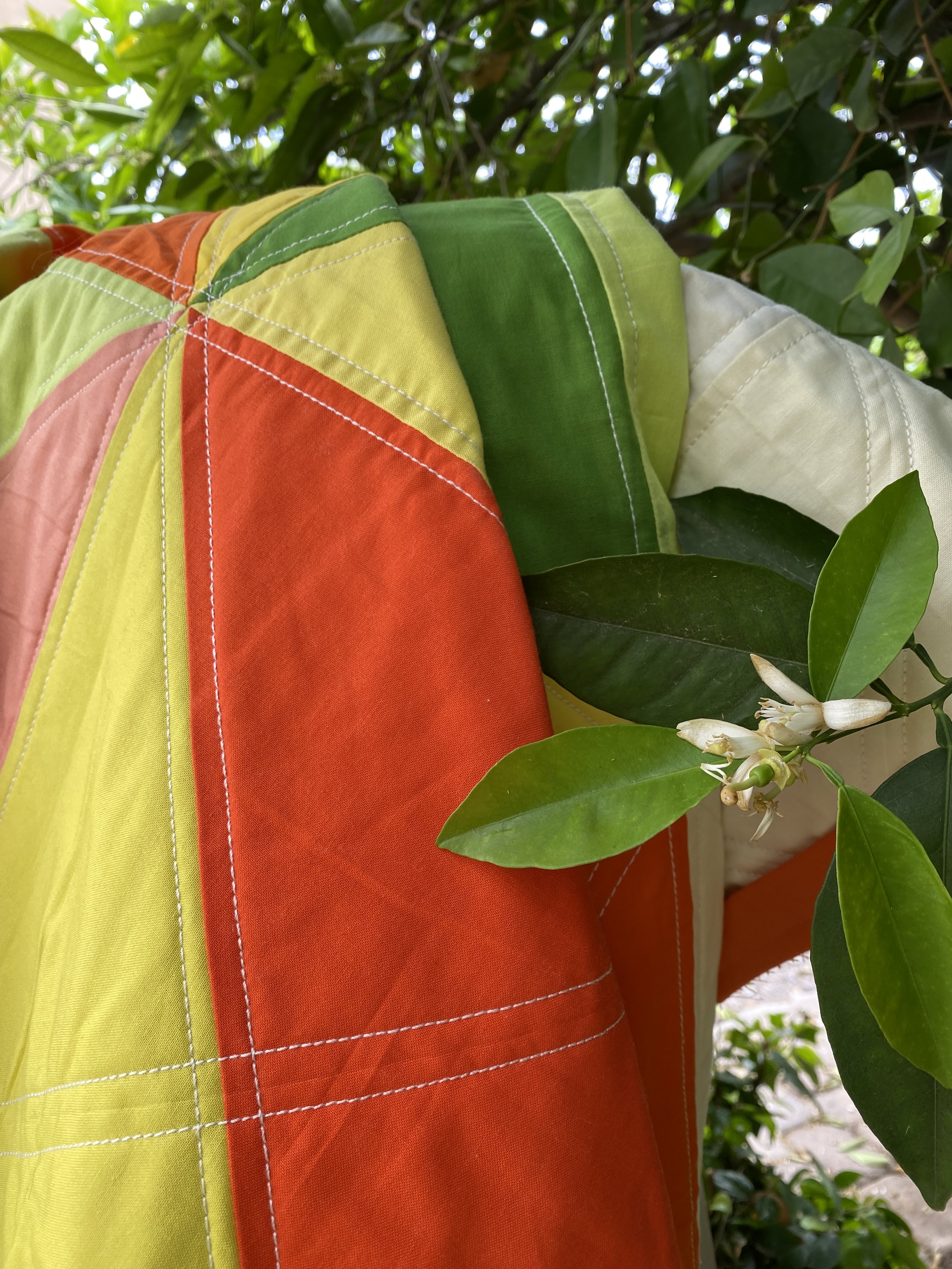
whiltshire rows is not my favorite liberty + chambray quilt make. the colorways for this one didn't blend as well as my other quilts from the series. there is one print in particular that i really don't like at all with the rest of them and wish i hadn't put it in. oh, well. i'm actually quite pleased with how nice it looks here in the fields, among the rows. it's making me feel better about the finished product.

d3 likes it and is so happy to know it's hers, that she doesn't have to steal it from me now. i put it in her easter basket to gift it to her. we were making-do with beach buckets and bags and things since i didn't bring the easter baskets from home with me. when she found the quilt at the bottom of her "basket" bag, she asked if it was just for filling or if i was giving it to her, haha. yes, babe, it's yours.

details

fabrics: liberty "wiltshire" in various colorways and moda crossweave in "chambray"
backing: liberty "wiltshire" in (d), single piece in navy and pink colorway
pattern: own design, 2.5" strips and squares in alternating row configuration
binding: blue herringbone flannel
quilting: handquilted echo quilting in chambray pieces with auriful 12wt in 2021

*i didn't take any more detail shots to add to this post. if you're interested in seeing the various details, click on the links above for close-ups of the different parts.

Wednesday, April 23, 2025

outtakes of the lake


there is a hillside across the road from our beach house that has yellow blooms coming out (see below). i've admired it at as the lowering sun lights it up every evening before sunset. because of the red hill and yellow flowers, i thought it would make a nice setting for a finish photo for "fall paint lake." one evening, i got my husband to go out and shoot some pictures with me.

this was the setting i had in mind:


i wanted to stand there somewhere near the bush, holding the quilt up.

i ran across the road and stood where i was thinking and my husband took a shot or two. then he said i needed to move further north (left) because the light wasn't really on my spot anymore. the problem with that is there's a lot of road objects just to the left of where i was standing.


he said, "just climb up on that concrete barrier so you can catch the light." it was a little narrow, but i managed to stand on it, and he started shooting.

when i came down, he said, "i got the barricade and everything in the shot." that's when i realized he hasn't assisted me with quilt shoots before, hasn't really seen "quilts in the wild" pictures, and wasn't thinking anywhere along the same lines as i was when it came to the photos.


the few closer looking shots in this series are photos i cropped in on after he took them.


while i was standing on top of the pylon, i was playfully wobbling around, balancing on one foot, and he took a picture. ironically, this is the one photo he zoomed further in on and you can't even see i'm balancing on a ledge 3 feet off the ground, haha. 

it's ok. we tried.

we lost the light at this point and decided to try again another day. maybe. we'll see if we do or not. there always seems to be something going on at that time of day, usually dinner.

so these may or may not end up being my finish shots for "fall paint lake."


this quilt has a lot of cute novelty prints in it. i used a lot more heather ross than i have previously used in non-scrap quilts. it also has that orange-ish red strawberry print and the golden dylan m animal print. if it didn't have these touches, i'd probably rename it something to do with our beach house living. 


the binding is a cadet blue print from the top. it has strings of lights on it that read as random dots on the binding. i'm happy with it.


the backing is two large pieces: a cute grey check from "orchard" by april rosenthal for moda and the luna moth print from heather ross's 20th anniversary collection for windham fabrics. the grey is a great low-volume neutral i use a lot. the luna moths are just pretty and fun. i've used them a few places, as well. i'm not much of a purple fan, but this is a pretty print.

i was able to work both selvages into the backing, one of my personal favorite touches. i got to thinking the other day that for non-fabric nerds this might seem strange. people who aren't into quilting designers and fabrics might wonder why i didn't cut that part off, why i left all the print in. but i love it. i am a big fabric nerd and i do like having the lovely selvages sewn into the quilt so i can forever see them moving forward.

i'm guessing this is the finish post for this quilt. it's not likely we'll get around to shooting it again. it actually makes for a fun story even if it didn't turn out the way i wanted. he'll be a better trained quilt husband next time.

Wednesday, April 16, 2025

wiltshire rows under the sun


"wiltshire rows" is a finish.

now i can give it to d3 at easter if she comes to visit us. her college finals end the day before easter, so it's undetermined if she'll come right away or need some time to pack up before she can leave. it's up in the air like so much else in our life right now.

i'm sure there is somewhere around here where i can get some nice finish photos of this quilt, but for now i just threw it over the lower deck chair and snapped a record of it being done.


this was a quick binding finish. i had it done in two days.

i worked on it sitting inside on the lower level (above) in my favorite chair, and while we listened to our church's spring general conference over the weekend on the upper level (below).


 i think this one is best viewed all squished up. the backing is lovely and i think the wiltshire pieces in the rows look better when all jumbled rather than laid out. 

it's nice and squishy and should look that way when seen.

i've just realized maybe this could be called "wiltshire waves" rather than "rows." the rows could be waves and there were certainly many in view the whole time i was binding. 

wave upon wave upon wave.
it's amazing the way they never cease.

Tuesday, December 31, 2024

fall log cabin, a finish


closing out the year with a finish from earlier this month i just realized i never posted about. i completed the handquilting on fall log cabin just as fall was about to become winter. december is christmas season, but winter doesn't technically begin until december 21st, the winter solstice and d1's birthday. so while everyone else on the quilty internet was posting about their christmas makes, i was still in autumn, and it's where i'm ending the quilting year.


i really enjoyed the handquilting on these log cabin blocks, even though i managed to bungle nearly half of the blocks when making them, which made it harder to handquilt since they didn't all follow the pattern the way they should. 


usually with a log cabin block you start at the center "hearth" square and add pieces by rotating a quarter turn each time. it's simple enough, but i turned my blocks the wrong way more than once. from a distance, they all look just fine. it's only when you study them up close that you notice something is occasionally off. take the bottom right square in the above photo - you can see the hearth is not centered because i put the very last strip on the opposite side of where it should have been. but it's still my favorite block of the whole quilt because of the fabric pairings in it. maybe someone will get a laugh out of it someday if they notice what i did.


fortunately, i seem to have got the hang of making the block correctly as i'm currently working on a christmas liberty + crossweave log cabin quilt. fingers crossed i continue to get it right from here on out!


i really love this cozy, traditional quilt made in modern prints and fall colors. there are a few prints i absolutely dislike, but they worked color-wise, so i included them. i never learn, do i? i know that putting an ugly or unsatisfying print in with prints i do like won't make me like it anymore than i already don't, but i do it anyway. and it's ok; i am actually getting better at not being bugged by those poor fabric choices. this time i even managed to make one block almost entirely from the prints i like least in the quilt, which makes me laugh now. overall, still highly satisfied with the results.


being a fall quilt, i really wanted to shoot this one in a fall setting. lucky for me, in our desert home the fall colors don't really start until december. in fact, they weren't as far along as i hoped when we took these finish photos, but they were good enough. 


i had my eye on this local riparian retreat full of changing cottonwood trees as i was finishing up the quilt and looking for a location to shoot it. i've never stopped there before even though i've driven past it several times a week for a decade now. it was a great find and perfect quilt shoot location. the only problem may be i used up all the shot locations already in this one shoot.

fall is long gone now, but there will be another one soon enough with the new year.

i wish you all a happy and cozy new year!