Friday, May 17, 2019

needle notes


sunday afternoon i walked into my sewing room to locate a new needle for handquilting "beauty for ashes" quilt. as i looked around the room i recently (but not completely) rearranged, i realized i was looking in the proverbial haystack for a new needle! i have no idea where the particular orange box containing my tulip betweens was hiding in that vast and convoluted space. so i grabbed some sashiko needles from the same maker and quickly shut the doors behind me.


i've been using the same needle for several of my handwork projects for months now and figured it was a good idea to replace it, like you do with the machine periodically. it wasn't giving me any trouble, but it just seemed long overdue since i've handquilted a few quilts and bound several others all on the same little needle. it's slightly bent after all it's use.

i had the sashiko needles around because last time i was at the sewing store they didn't have the sharps i wanted in stock. sashiko is a handwork tradition so i thought it might be a good bet for my handquilting. i know absolutely nothing about sashiko other than what i just said, so i knew nothing about it's needle's dimensions or properties.

well, the needle is larger and longer. it's easier to get a grip on than my tiny little sharp was. and the eye is more compatible to 12wt thread. but it didn't allow me to make my stitches as small as i was used to doing. and it was difficult to push and pull through the fabrics. i felt like i was punching holes in the fabrics. perhaps this is all my inexperience or because i'm using it in a way not intended. who knows? obviously i need to research that more.


either way, after struggling through one row of stitches, i located my warped old friend and got back to work. despite it's age and extensive use, it still slides through the fabrics quite easily and oh so daintily. yes, the eye is still a challenge to thread, but it's manageable (with my readers on and a little patience) and i feel like it leaves less of a mark behind than the large needle did.

i don't have time to trek over to the fabric store across town, but i did locate more of the needles i want online. until then, this trusty little fella is working for me just fine! i'm curious to see if a new one feels any different at all.

Monday, May 13, 2019

Mildred and Ethel

The last time I was ordering crossweaves for some more Liberty + crossweave quilts, I saw an olive green crossweave that I thought might be nice to try for a change away from my neutral neutrals. (I think you can use certain colors as a “neutral” for a background, like in nature - blues, like sky, and greens, like foliage, in particular.) I was ordering from my phone and the thumbnail photo of the green crossweave had a sort of grunge/crosshatched look to it that all my other crossweaves and chambrays did not. I figured it must just be something about the way the colors photographed. Well, it came and it looked precisely like the photo did! 

I was really confused. The look and texture were completely different from all the other crossweaves I had ever seen, and not in a way that pleased me. I’ve lookked about a bit on the internet and apparently Moda makes two sorts of crossweaves. Now I know. This one is more like a barkcloth, similar to the Outback Wife fabrics I have. I really didn’t like it at first and didn’t know what I was going to do with it. 

But since it has such a retro look and feel to it, I decided maybe I could pair it with some other retro-ugly fabrics I have and it might actually make something I could love to hate. With more projects on my plate and in my head than I can ever complete, I don’t know why I even gave this a thought. But I scrounged through my Liberty stash for those prints I don’t like and also pulled some I do like that matched and came up with something kinda funky and vintage and likable. 


There are six Liberty prints here that speak a certain vibe to me which pairs with the grungy crossweave. Three of them are prints that I was never going to use anywhere else, so I figured it was worth a shot to use them now. The other three I do like but I’ve used them before so the leftovers were expendable. So despite the fact that I have oodles to work on already, I cut into this stack of funkiness and made some triangles. All my other Liberty + crossweave quilts are random bricks and strips patterns, but something about this pull was saying triangles and diamonds to me.


These are two of the prints I wanted to use up, so I cut as many of them as I could from my yardage. They will both feature twice as often in the quilt as the others will.


I'm using up the bulk of this Betsey in yellow for half the backing and on the front.


The backing is also a departure from my previous Liberty church quilt "score" I was working from. I didn't want any of those "ugly" prints left, so I worked what was left from cutting triangles into strips for the backing.

It's been a while since I sewed any triangles, so I looked up the method online, thinking there was some trick I was forgetting. Nope. Just line them up and fold them over to sew. They came together so fast!


I'm making green diamonds and the Liberty prints make patched together diamonds of two prints.
I could hardly have picked two sillier fabrics to cut into triangles and sew on the bias cuts, but they behaved nicely enough. my points aren't all perfect or completely lined up, but with the amount of distortion and stretching I could have had compared to what I got, I'm not complaining. Triangles want to be triangles even when your tana lawns and crossweaves also want to stretch bit.


This weekend my husband was so sweet and gave me the gift of time to do as I liked as a Mother's Day gift. So in only 4 days I had the quilt fully pieced, a backing done, and everything pinbasted, ready for some delicious handquilting. This is an unprecedented record for me. Have I actually gotten a bit faster at quilting? That seems to be a theme this year, so maybe I have. And along the way I've actually pretty much fallen in love with this crazy, funky quilt. 

It reminds me very much of something that would have been found in one of my great-grandmother's houses during my early childhood at the dawn of the 70's, perhaps something that had been there since before my birth. Maybe it was that combined with Mother's Day weekend that inspired me to name the quilt "Mildred and Ethel" after my two maternal great grans, both of whom I knew and visited a little in my toddler years. 

Four Generations: Grandma Dorothy holding my sister Loree, Ethel (Dorothy's m-i-l), me held by my mother Jan (Marmee)

Ethel, for certain I remember, and her lovely backyard garden in Logan, UT, with the Logan temple (where my parents were married) in the background. Her basement with the taxidermy always creeped me out, but I enjoyed the rest of the house. It's part of my earliest memories.

Mildred I remember less well, but I do have a few distinct memories of her home: the Christmas village with train under the tree in winter, a refrigerator on the back porch, and her cherry trees, which seemed a vast orchard to tiny me, but were apparently only a few in number. Apparently I don't have any photos of me with her, either. I'll have to go to my aunties and see what they have for me.

I'm not sure which lady is the green crossweave and which is the Liberty, but the two distinct fabrics make me think of there being two of them. I'm also going to handquilt this in two colors, white and olive green, one for each lady.

With summer coming on fast, I am trying to get as many projects as possible into handwork mode so i have something to take on our travels that doesn't require me to be a machine. I'm pretty chuffed to have this vintage-esque lady in the position to be handquilted to my heart's content.

Tuesday, May 7, 2019

crossweave, pastels, pins


this past week i made time to complete the piecing for my newest liberty + crossweave quilt, "beauty for ashes." mostly i was itching to complete it so i could have a handwork project. now that it's ready for handquilting, i don't really care how long it takes. but since i like to work at it whenever i can, i don't anticipate it taking too long.


the black and white crossweave has the look of a nice deep grey linen. that's one of the characteristics i really appreciate about crossweave - it has a look and texture more reminiscent of a linen, but without the unraveling issues since it's actually cotton.


this liberty tana lawn "mitsi" print in yellow was an exclusive colorway made for alice caroline supply that i simply adore. this colorway is so buttery soft and cheery, not to mention "mitsi" was my very first favorite liberty print. i do have a few favorites now, but "mitsi" is still up there in the rankings.


i've put a lot of pastel goodies in this quilt; all my softest-toned tana lawns are here. as usual, there are a few i don't exactly like but i've used them anyway.

yes, there are liberty prints i don't like! and i own a few of them, too. online ordering does that to you sometimes. not everything is as it appears on the internet, in case you didn't know.

although there are some liberty prints that i don't seem to ever like, with others it's more a matter of the colorway. even my favorite prints come in colorways i'll pass on, while the right colorway will occasionally attract me to a print i don't normally like at all.

but i can tolerate the not-so-favorite liberty prints enough to include them in the quilt. i think they give that touch of subtle "ugly" that makes a quilt feel vintage and homey. some quilts need a touch of that. (if you know what i mean about the slight touch of ugly, you get it. if you don't - i don't know how to explain it!)


"eloise" (between my hands) is a print i've taken a liking to lately. there seems to be a handful of really cute colorways for "eloise" on the market at the moment.

"betsy" (the other yellow on the far left) is still a top contender. this yellow version is unusual and especially nice, too.


i was surprised once again as i basted this quilt that i do actually rather like pin basting. it can get hard on the knees since i do it on my tile floor, but the actual process is rather pleasurable. i enjoy it in a way i don't like the spreading and pushing involved in spray basting. maybe it's the slight similarity it bears to handwork?

with all the pins in place, it's on to handquilting next!

Friday, May 3, 2019

liberty makes do too, a finish


some late afternoon snaps of my latest quilt finish, "liberty makes do too."

this quilt came about because i overcut fabric for my first liberty + crossweave quilt, "liberty makes do." i had to "make do" with all those extra pieces, so i came up with a new variation on the pattern for the first quilt and called this one "liberty makes do too," a play on words and reference to the original quilt.

there are nice close-ups of this quilt in previous posts and on instagram, if you'd like to see more of the fabrics upclose.


my littlest happily snipped any loose threads and ends for me as i finished up the project.


for the backing, i again selected one yard cuts of two liberty tana lawn prints. it makes for such a snuggly, luxurious backing. it's definitely a splurge, but for a small quilt i will do it.

another justification is that this is a lap quilt and the back gets seen quite often. it's not as if i've hidden all that lovely tana lawn away somehwhere.

as with the first quilt, this one has become a "church quilt" - one we take with us on sundays to keep our laps warm in the frigid AC that's always just a bit too nippy for us.


this quilt has d'anjo in pinks and betsey in blues on the back, a pairing of two of my favorite liberty classic prints. i guess that's another excuse for the backing splurge - i want a place to preserve large cuts of my favorite prints so i can see them and revel in them on occasion.


another luxury i put into this is the handquilting (aurifil 12 wt in white).
giving myself the time and leisure to handquilt a project is a gift to myself. the more quilts i have done, the more willing i am to slow down and do this, particularly on smaller-sized projects like this one.

i've always loved the binding phase of a quilt for the handwork involved and i'm leaning more and more towards doing the quilting that way, too.

above photo is me putting the final stitch into the binding of the quilt. i happened to be wearing my liberty of london dressing gown, made in emilia's flowers print, which is also in the quilt in the same colorway.


which brings me to the binding. even though it began to pill, which is annoying, i decided i still liked the herringbone striped blue flannel i used for the binding on the first quilt. it's a nice contrast to the other fabrics and colors in the quilt and the pilling seems to have tapered off with initial use. 

this quilt is now fully in church rotation use. in fact, i've had to tell the girls they can only use these quilts on sundays because they tend to want to use them for everything. because of the delicate nature of tana lawn, i'm keeping these for sunday best.

we're going to need 6 church quilts total, and the next one, "beauty for ashes," is already in the works, as is the search for a proper name for the quilt series.

Wednesday, May 1, 2019

wip wednesday 2019.18


at the moment, i have three main projects in the works (not counting all the other bits and pieces of projects having a lie about) but none have been touched in a few weeks.

"maude's chevron peaks" is about 1/4 - 1/3 quilted in some simple modern loops.


"groovy summer love letters" is hanging out in the piano room waiting for some binding, which i can't seem to find a good fit for just yet. all folded up like it is, it appears to be a finish. shh. don't tell.


newest project: my latest liberty church lap quilt, "beauty for ashes," is halfway pieced with 11/22 rows completed.

in the above photo i also spy "etoile de patisserie," which need the quilting fixed before i can get on with the binding, but since it's been so many months since i even thought about that, i hardly even consider it a wip at all. my daughter would disagree.

Quiltcon Nashville 2019

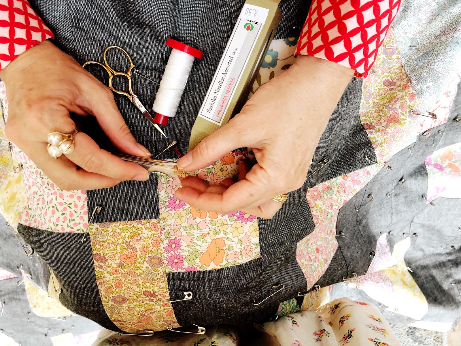
 My blogging spree at the beginning of the year came to an abrupt halt when I went to Quiltcon in February. This was followed closely by some intense family time, which was then followed by a lot of travel. Quilting was interspersed through out, but blogging was not. Quiltcon Nashville is pretty old news at this point, but I’m going to throw my impressions up here, anyway. It's a rather exhaustive post that matters to no one but me, so feel free to skim or skip.


This was my “Hello, Quiltcon” photo I posted on IG, taken by my 7 year old on a day where I had just come from laying face down on a massage tabletop an hour to get some therapy work done, which always makes for a puffy face. But I digress!

I made one attempt to go to a past Quiltcon (Savannah), but in the wake of my my husband’s accident preceding it, I had to back out. Last year, after another Quiltcon came and went, my online quilt buddy, Tracy Loukota, and I began toying with the idea of going to Nashville. I lived in Nashville for the four years of high school and always enjoy getting to visit again (sorry, Tracy, I had to say that one more time!). We hemmed and hawed about going, and finally decided we just couldn’t make it happen.

But . . .

Long story short - about a week beforehand we changed our minds and went!


We didn’t take any classes, we just went to meet each other in person, finally, and to have a look around. My reaction to the experience is mixed. Overall, it was positive and I’m glad I went. The best part was definitely the people! Admittedly, I was a little nervous to be meeting online acquaintances in person. But, as with my previous experiences, it was fantastic. Tracy and I roomed together and were basically joined at the hip for 3 days/2 nights. I also managed to meet up with two more ladies I have known online for quite a while: Kelly Young of My Quilt Infatuation and Janet Middlekauf of Simply Pieced.


Even the strangers Tracy and I met were wonderful people and added a lot to the experience. While wandering the show floor, this lady, Erika from Colorado, overheard me mention “Liberty of London” and we struck up a 30 minute conversation about Liberty. Unfortunately, she isn’t online with her quilting at all, and we have no way to keep touch with her. But the old scrapbooker/photojournalist in me knew I wanted to remember her and the moment we shared, so I was all awkward and made her take a picture with me. 

We also shared a breakfast table at Biscuit Love with a nurse who was in town for another convention, met a very enthusiastic 14 year old quilter and her mother outside the show, and had good experiences with all our Uber drivers. 

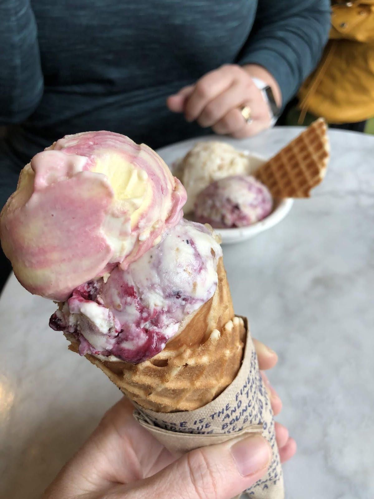
And then there was the ice cream.


jeni's splendid ice cream, just a few doors down from anna maria horner's craft south.

But we're here for quilts.

Here are some of the quilts that caught my eye. Warning: absolutely horrible photo snaps. The setting for the quilt show is one of the worst places to view quilts, and not just because of the lighting. I've tried to provide links to better photos of the quilts from other sources, when possible.

and this is one of my first impressions to share about quiltcon - it's not a great environment for viewing quilts. it's a cold and stark, neutral atmosphere that does not flatter or enhance the quilts. i much prefer seeing quilts in the settings we normally use them in or photograph them in for sharing. i saw quilts here that i really liked when viewed online that were not as well exhibited in this setting.


I get all the reasons for the way the show was presented, but I was also struck with how the setting affected my perceptions of the quilts. A neutral setting (the drab curtain dividers the quilts hung on) allows you to focus on the quilt alone. At the same time, I realized that seeing the quilts in their natural settings and true contexts (in homes, with people, or even outdoors like we usually see on social media) greatly enhances the perception of them as snuggly, comfort objects made to be used and loved. Quilts I'd seen online came across completely different to me when they were hanging in the show. The entire atmosphere of the convention center hall is rather anti-quilty. It had to be a large venue to accommodate the number of quilts and people and this was a large, industrial venue, not a quilt's "natural habitat". 

This beautiful quilt of Daisy's didn't photograph well at all for me - you don't get the wonderful colors coming through a bit.

This one reminded me a lot of the quilts I made for my boys because of the color palette.

Color and the repetitive, simple shapes attracted me to this one.

Sometimes it was a portion of a quilt, rather than the whole, that appealed most to me.

Wild Goose Riot
Tracy and I particularly like this scattering of triangles. We decided we like a scattered, random kind of look with a variety of sizes in a quilt. This was her personal Best in Show and one I like a whole lot, too.


the charity quilt color palette for this year, set forth by the modern quilt guild, was not a favorite for me. i thought it was okay, but it didn't wow me and is not one i'd choose to work with. 

however, there were lots of cool designs. i was greatly struck by this improv wonky plus quilt from the edinburgh modern quilt guild. i like the choice of block they worked with and the layout. and the fact that even the white sections are pieced wonky plus blocks is really cool. not something i'd probably do on my own, but easy to accomplish when many hands are working together. i recently visited edinburgh, home to several of my ancestors about 4+ generations back, and loved finding there were so many quilters there, which i was unaware of.


i really loved this quilt. yes, it's quiet and the color palette is subtle, but up close it's really nice. not every quilt has to be loud and colorful! this one is composed of the maker's husband's old dress shirts. it's really fantastic and just the sort of thing i'd like to make from my family's clothes someday. this kind of quilt has always appealed to me. i love the repurposing of family clothes into a comfort item like a quilt. it's like wrapping up in a piece of them.


the feature artist for the show was sherri lynn wood. i found her quilts quite interesting and thought this bereavement quilt very nice. the explanations for her process behind each quilt went shed so much light on what she was thinking as a maker. sometimes this adds a lot to my feelings about a project, as they did here. 


this quilt was clever representation of a phone screen and apps. i particuarly liked the mottled, mixed background of the "screen" color. it's rather like what i've done with some of my stella grande quilts.


quiltcon is a show put on by the modern quilt guild, and as such, has a very particular flavor of quilts on display. there is plenty of variety within that catagory, but it isn't particularly well rounded or inclusive of multiple quilting styles, many of which could be called "modern" by some. here is what we saw a whole lot of:
  • all solids quilts
  • any prints in a quilt were either anna maria horner or alison glass, but these were few and far between
  • super dense quilting, preferably matchstick lines exclusively
  • political or statement quilts, but only of a specific leaning
  • geometrics and improv
now, i did find plenty of quilts to look at that i liked a lot. absolutely.

but it did make me feel that if i want to call myself a "modern quilter" that there is basically only one way to go about it. i love solids, geometric, and improv. i play with them myself. but is there really only one "modern" way to do this? and what about branching out from matchstick quilting a little more?

the political side of it was especially one-sided. maybe this is because only people with certain political views make those into quilts? or is it because only quilts with a certain leaning were accepted? the political nature of these quilts did not bother me, but the lack of variety did. it was as if only one perspective was welcome and the way the write-ups were written it was expected that all quilters would share that view. it made me want to go home and make a quilt that said, "everyone is welcome here." 

perhaps i shouldn't have been surprised to find this, but i was. and it left me less happy about the show than i expected. tracy said we would likely find the houston quilt market show more our thing in general since it wouldn't be as narrow.

the vendor's booths at quiltcon were a lot more inclusive and varied, less strictly "modern." there were definitely prints for sale everywhere! here are a few appealing quilts i found:


this was a sample quilt in a seller's booth. lovely movement in the triangles, impactful but not complicated.


i thought this was a really nice house quilt. i like the spacing of the houses and layout in general more than when the houses are just laid out like blocks in a grid.


the new ruby star society looks like it's going to be as good as the former cotton + steel was. i loved this star quilt (maybe a lonestar?).


the bibliophile in me swooned over this "personal library quilt" pattern. i'd make it in brighter colors, myself, but the idea is fantastic. many of the spines have titles from the maker's own books.

that was my quiltcon experience. the time tracy and i spent eating and putting about nashville (not much thanks to the weather) was really great. i loved seeing my quilty people and meeting new ones.

will i go again? i really am not sure.
i may have gotten it out of my system for a while.
i definitely won't be having any fomo over not being there in the future.