

this quilt was a finish well over a year ago, but i wasn't blogging much at that time. "mary, mary, star contrary" is the first of my children's stella grande christmas quilts to be completed. it belongs to my oldest daughter, d1.
i finished it barely in time for her to fully enjoy it for just a few days before she left on an 18-month volunteer trip to eastern europe. time must have flown, or at least it's passed, because she is now only about 6 weeks away from returning home. i'll have to pull the quilt out and get it freshened up for her very soon.

i completed the last binding stitches just before we entered a canyon at the golden hour on a weekend roadtrip. the full beauty of the canyon didn't come through in the photos very well as it's just in the background. but the bridge we shot the quilt on worked out really well. like every other quilt photo shoot i've ever done or seen, the wind made things more difficult, interesting, and playful. all part of the fun.

this post will be a mix of the finish photos and detail shots of the quilt's various parts. i do love details!

the color palette for the quilt came from two cotton + steel prints i wanted to use for the back: tomato reds, cinnamon, peach, sand, petunia, coral, grey, and a touch of navy/midnight blue. it was an unusual palette for me, but i reeeaaallly liked working with it. delicious.

originally, i had this particular quilt earmarked for my other redheaded daughter, d2, but in the last few days before gifting the quilts, i began to doubt myself. at the last minute, i consulted with d1 and she said she'd take this quilt over "etoile de patisserie," which was meant as a nod to our trip to paris and love affairs with its pastries. she really liked the colors and prints in this one, so i think we got it right in the end.
.

the name of this quilt came about in reference to d2's periodic contrariness, the floral prints (mary's garden growing) on the backing, and the way i put bits of the dark blues randomly in the star. all of those elements collided in my brain to be "mary, mary, star contrary." however, once i switched up recipients, it didn't seem to fit so well. this daughter is the least contrary person on the planet! but the name had stuck for me.
and so, there you go . . .

i really adore the effect of the blue bits i worked into the hsts, but they were, admittedly, rather fiddly to work with. it all came right in the end. i wanted a touch of the color, like in the florals, without the blues overwhelming the rest of the warm and softer tones. i had absolutely no idea what i was doing as i added the skinny strips to some of the hsts, but it came out alright. i think the narrow, 1" strips nailed the effect i was going for.

her hair has always been wild and free, practically an entity of its own. once, when she was about 4 years old, i interrupted her play attempting to smooth it back and out of her face. she said, "mom! don't mess with the wild thing's hair!" she does have a wild heart, but in a very good, virtuous kind of way. it's a beautiful combination.


each of my stellas have a variation somewhere, usually a unique border. for this border, i used the 8 colors of the star, 6 of which were paired tones of the same basic color (2 reds, 2 purples, 2 browns). one of each pair color was used in the two different borders as a 2" strip, and a flying geese block of the 2 unpaired colors (pink and grey) was centered in the strips. i'm very pleased with the outcome of this configuration. for some reason, the border stripes make me think of chocolate bar wrappers.


the difference is subtle, but i used 2 different dark blues for the slim accent strips in the star, to reflect the 2 different blues in the main backing fabrics. i chose the midnight blue as the binding. i love how it outlines and sets off the other colors of the quilt. sometimes you want a border to be bold and make a definite statement, and sometimes you just want it to mingle with the rest. this one is definitely the bold, strong kind.

binding is always one of my favorite parts of the quilt making process.

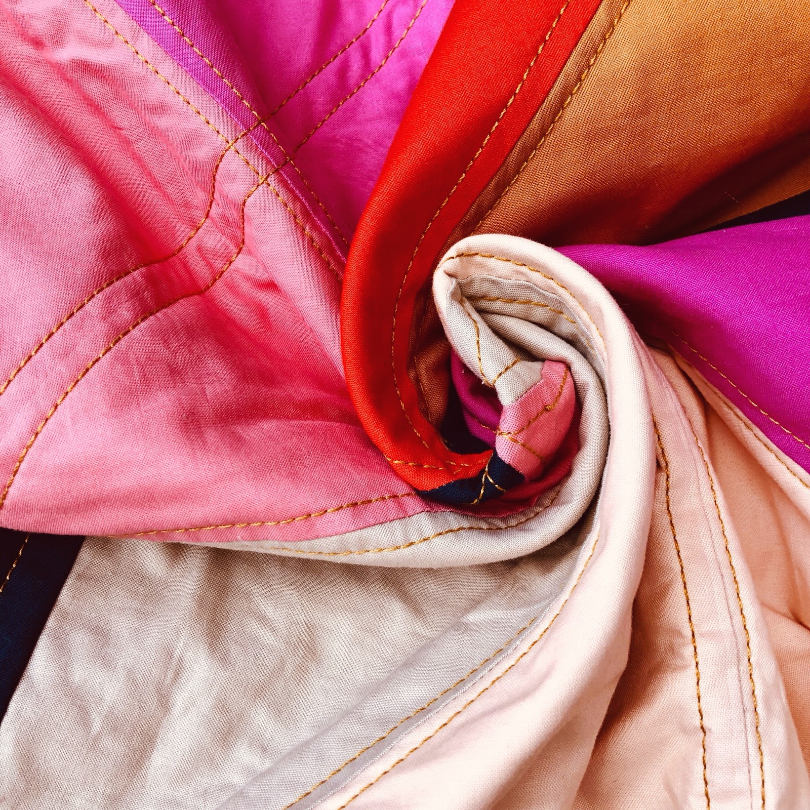
quilting was done with the lovely, chunky aurifil 12wt in brass. i use a large stitch length (4 on my juki), which i think has a similar effect to handstitching. there isns't a ton of quilting in these quilts - just a quarter inch echo of most of the seams. i like to use a high contrast color so it really stands out.


always smiling, that girl of mine.


i snagged a few shots in a parking lot at a different stop about an hour before the canyon, but the dog and the wind were a bit too much at once.


I love the quilt and I love the photos...but, I really love the wild thing's hair!!
ReplyDelete