

"star in the fairy forest" is a finish and has been handed off to my daughter, d4, it's new owner.
she and i will have to take it out for a location photo shoot at some point, but in the meantime, i took a few shots of it, particularly of some of my favorite details of the quilt.

that little strip of the mushroom forest print to the left of the coral star point (liberty "fairyland" in melon) is one small scrappy detail i added for fun. it's not part of the quilt's pattern or main design, but an element i slipped in on a whim. i think these bits give quilts a make-do, pieced-together feel.
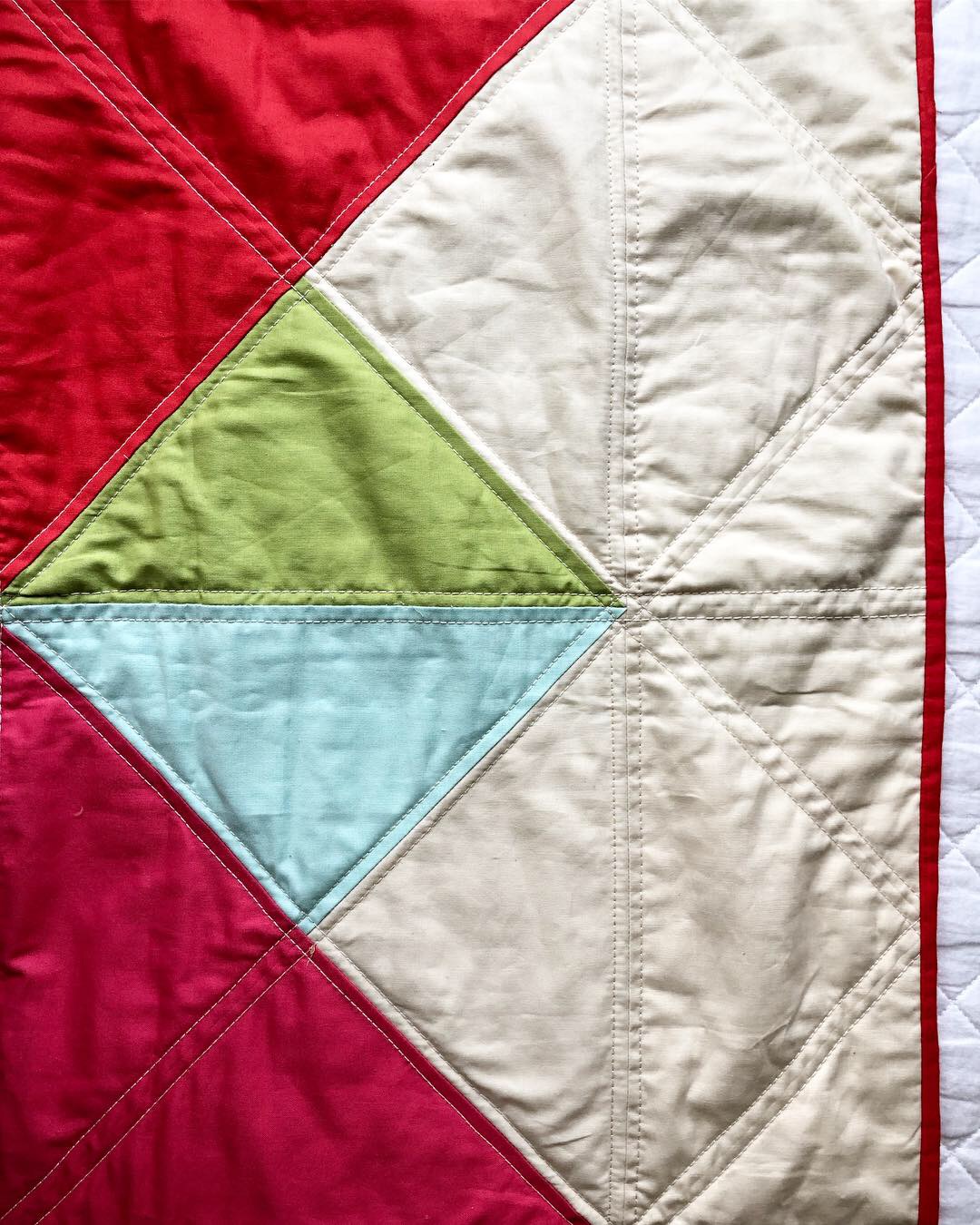
this quilt is a variation on my "stella grande" large sawtooth star pattern. these medium-sized blue and green hsts i put in between the star points are one of the ways i varied this quilt. perhaps this makes this a different kind of star, whose name i'm unaware of, rather than a sawtooth. but my quilt history knowledge isn't suffiencnt to know what it might be called.
i added these blocks in so i could use more of the color palette i had in mind for the quilt and place touches of the colors in more places than i did with my other "stella grandes."

the fiery tomato red paired with the icy pink and blue is such a pretty color combination, even if it is a bit washed out in the sunlight here.

a meeting of points. so many seams packed together there. these spots give me a bit of trouble when i quilt over them, but juki and i manage.


much of the quilt bursts with color, but when you pay attention, you can find small, quiet pairings of color in places like this intersection. i like to zoom in on these small details because they have a different feel than the quilt as a whole, yet are still a part of its character.
plus, that little grid made by the stitching with aurifil 12 wt pleases my senses, too.
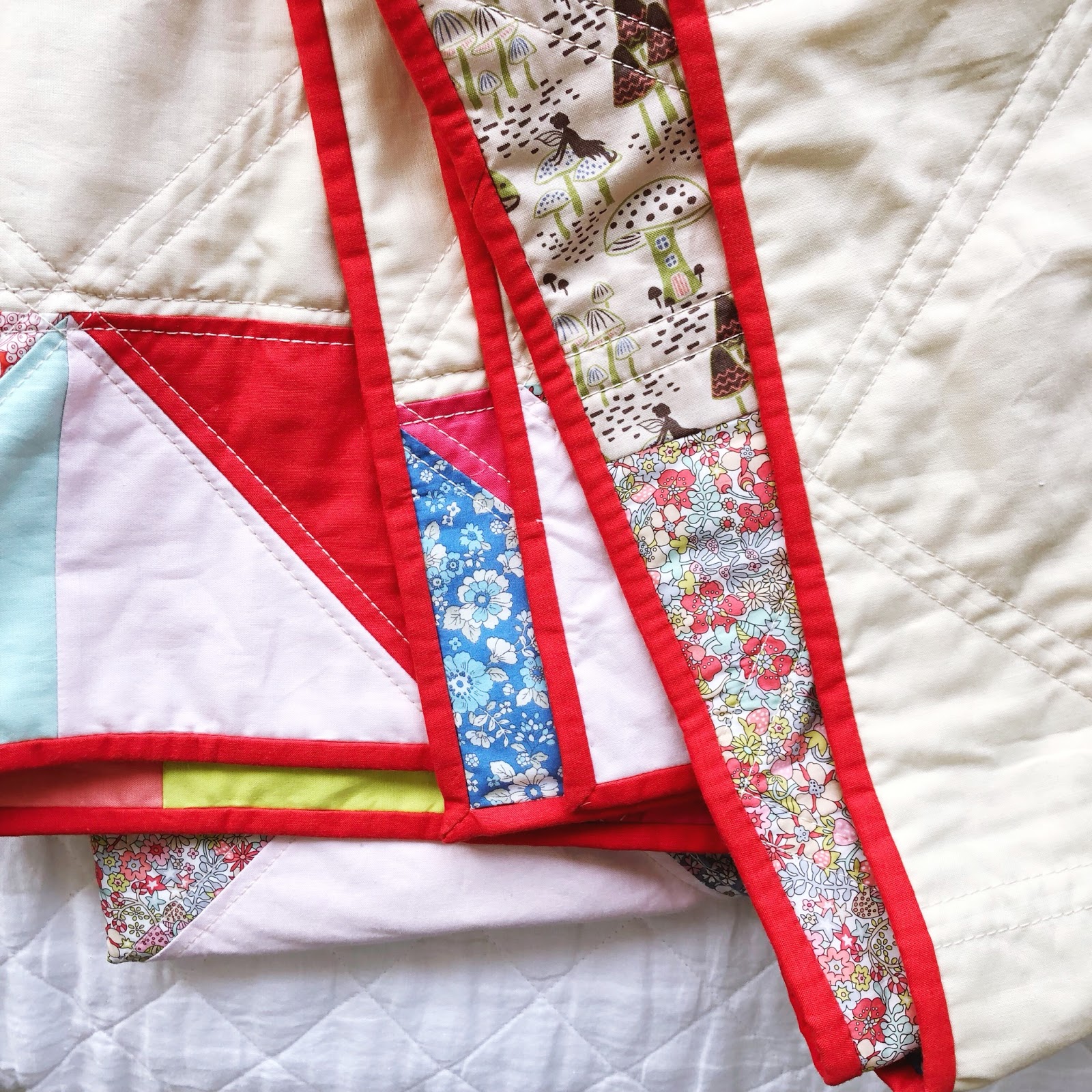

i used prints on the top of this quilt, where my other "stella grandes" were strictly solids. each print represented one of the solid colors from the top, and was used interchangeably in the design. this colorway of #libertyjunesmeadow was the grey print.
three of the prints were liberty of london tana lawns, one was a lecien "memoire a paris" lawn, and the last was a quilting weight print. the use of the lawn gives a luxurious feel to the quilt, especially since it comprises most of the backing. it was a little tiny bit persnickety to work with, but really not that bad at all.

here you can see the two main prints that were the inspiration for my color palette and the quilt's name: liberty's "flower tops" and the mushroom forest fairy print, "enchanted forest" by lewis and irene. they had mostly the same colors, but in slightly different shades of each. by using the color variations from each print, i got some nice color play in the quilt top. and the parchment background color from the fairy print inspired my background choice for the quilt's top, also.
the addition of the smattering of prints on the top gave this quilt a vintage feel the other "stella grandes" don't have. that's something to love and admire about this quilt. they each have their own distinct personality, much like my children.

another happy finish of my #7kids7quilts series.
this is no. 5 of the 7.
almost there.
This is a very sweet and happy quilt. I love the colors of this one, Hydeeann
ReplyDeleteI love the large star.