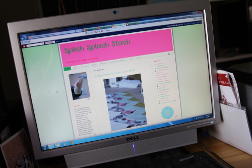
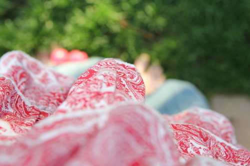
actually, i was wearing the apron because i was baking orange-infused scones and making them into strawberry shortcakes. but it was a more exciting intro and better photos than my old blog screen look. and the baking was much less impressive than it sounds yet every bit as delicious as it looks.
i signed on for a blog design course, blog (design) love, that i saw elise blaha cripe and elsie larson were offering mainly because i wanted to make my own banner for this blog, but also because i was interested in customizing it a bit in other spots. it wasn't that expensive and i was intriqued.
that's all rather silly since no one really reads this blog but me and i already have a ton of things to do. why would i spend time designing a new blog look just for me? well, it sounded fun. and it is. and i'm learning a lot from the course, which so far rocks. already i've gotten some great insight into making the blog more "me" style-wise. now, i'm just starting to get into the techi part of it. html code here i come!
 |
| original look |
 |
| first attempt at update - color story change |
some content changes i have made include revamping my "about" page to more accurately reflect who i am and what this blog is about. it's evolving and i need to streamline my text more, but i'm liking it.
i moved the long story of "how i came to sewing" from the about page to it's own post here and added some more photos for interest.
i created a page (with photos) for tutorials and removed the links to them from the sidebar. now you can access them from the tab at the page's top.
the apron page has become the gallery page because i plan to use it to feature any sewing projects that are not 4sqs or quilts. i do create those on special occasions.
i widened the content column so now i can use larger photos.
the sidebar has been tweaked a bit with lots more plans to be executed soon. i have ideas about pages, new ones and changes. but next up, i hope, is a custom photo banner.
since starting this post, i got my wish. after a few hours (i'm brand new to photoshop), and a few (several) goof ups, i have a new blog banner header which showcases my work and of which i am fond. yay for me!
my house could really use some clean up and decorating but today i'd rather do the blog.
so i've spent most of my creative friday in my office at the computer. the kids took care of themselves. in fact, numbers 3 - 6 scoured the house for our four tea sets (where did they all go?) and put together a tea party. so cute.


No comments:
Post a Comment
a kind word is always appreciated. thank you for your visit.