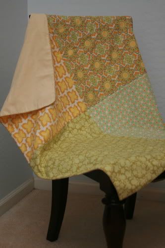
i forgot to turn the corner so you can see the back. i used a soft yellow that may or may not have been in the fabrics' palette, but it coordinated well. i wanted to use the dark celery color in the prints to edge the blanket, but couldn't find a perfect match in floss. so i settled for another dark khaki kind of green that complimented the print.
a better look at it laid out flat. i'm still working on how to best display these for photos. and working on my product-type shots period. people i'm comfortable with. my stuff photography needs work.
a close up of the dreamy meadowsweet 2 prints and colors. very nice! and my seam matching is pretty dang good, too. if i do say so myself.


No comments:
Post a Comment
a kind word is always appreciated. thank you for your visit.