
i've got a new fabric crush. sure, meadow dot in robin's egg/mint/aqua/whatever is still my favorite. that hasn't changed. but i've found a dreamy low-volume that makes for a perfect background or supporting fabric. every batman needs it's robin, and all those lovely feature fabrics in our stashes also need something to shine against, to help them stand out.
that's where this lovely woven stripe in natural from moda's pure simple line comes in. i stumbled across it at my lqs a week or two ago and got 1/2 yard because i knew it was going to be a brilliant supporting fabric. well, i've already used it a number of times in a few projects (here and here), so i'm thinking i need to go back and get about two yards more.
this fabric is a woven, which means two colors of thread were used to produce the stripe pattern rather than it being printed on the background fabric. this means no printing on the selvage since no printing was used in it's production, just like why solids have no printed selvage. also, i don't know if different thread was used in this line or if it's just because there's no printing on it, but the hand to these wovens is so lovely and soft.

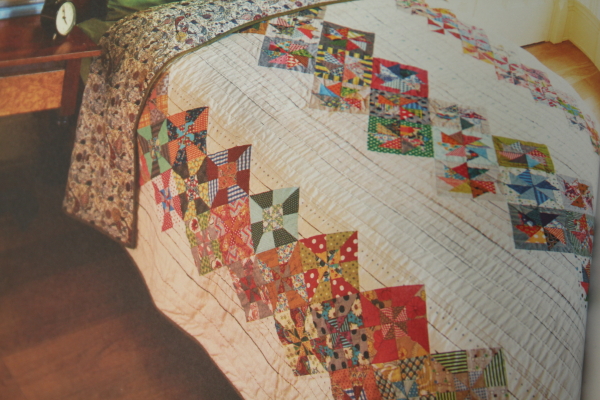
take a look at some of the quilts from her book and maybe you can see what i'm talking about.


so i just visited moda's website and it looks like "just a speck" will have some. and
"behind the scenes" is all about neutrals, too. yay! that makes it easy.

this is the kind of stuff i pick up over time as i study pictures of quilts i like. identifying such features helps me use fabrics and colors more effectively in my own quilts. thank you, jen kingwell for the lesson in neutrals and for helping me appreciate a family of fabrics i would have passed by before.
and thank you, moda, for that delicious woven stripe!
Ooooh just lovely stash enhancement--beautiful choices....hugs, Julierose
ReplyDeleteJust an FYI . . . Jen does have her own neutral line that is called "Behind the Scenes". I just discovered it in the last day or two. Pat
ReplyDeleteJen's quilt are amazing and what I call intense in a great way. I'm fortunate enough to have seen most of them up close. Whilst they have intense colour they are just remarkable and the best thing is you can spend hours looking at all the various fabrics used whilst admiring the overall design.
ReplyDeleteAnother nice feature of the beautiful neutral wovens I am noticing - no right/wrong side of fabric. Helpful when I cut the wrong directional triangle, sadly a frequent occurance :/
ReplyDeletethis is definitely a bonus! and i hear you about the directional cutting part. i specialize in that sometimes.
DeleteYes, I too agree, Jen's quilts are amazing. Those small scale neutral white/cream fabrics are so useful, as backgrounds or, as you say, even within the actual pinwheels. All it needs is a few popped in to really add that illusive 'sparkle'. Just wish it was so easy for the rest of us :)
ReplyDelete