Pages

Friday, September 27, 2019

mary, mary, star contrary, a finish


this quilt was a finish well over a year ago, but i wasn't blogging much at that time. "mary, mary, star contrary" is the first of my children's stella grande christmas quilts to be completed. it belongs to my oldest daughter, d1

i finished it barely in time for her to fully enjoy it for just a few days before she left on an 18-month volunteer trip to eastern europe. time must have flown, or at least it's passed,  because she is now only about 6 weeks away from returning home. i'll have to pull the quilt out and get it freshened up for her very soon. 


i completed the last binding stitches just before we entered a canyon at the golden hour on a weekend roadtrip. the full beauty of the canyon didn't come through in the photos very well as it's just in the background. but the bridge we shot the quilt on worked out really well. like every other quilt photo shoot i've ever done or seen, the wind made things more difficult, interesting, and playful. all part of the fun.


this post will be a mix of the finish photos and detail shots of the quilt's various parts. i do love details!


the color palette for the quilt came from two  cotton + steel prints i wanted to use for the back: tomato reds, cinnamon, peach, sand, petunia, coral, grey, and a touch of navy/midnight blue. it was an unusual palette for me, but i reeeaaallly liked working with it. delicious.


originally, i had this particular quilt earmarked for my other redheaded daughter, d2, but in the last few days before gifting the quilts, i began to doubt myself. at the last minute, i consulted with d1 and she said she'd take this quilt over "etoile de patisserie," which was meant as a nod to our trip to paris and love affairs with its pastries. she really liked the colors and prints in this one, so i think we got it right in the end.
.

the name of this quilt came about in reference to d2's periodic contrariness, the floral prints (mary's garden growing) on the backing, and the way i put bits of the dark blues randomly in the star. all of those elements collided in my brain to be "mary, mary, star contrary." however, once i switched up recipients, it didn't seem to fit so well. this daughter is the least contrary person on the planet! but the name had stuck for me. 

and so, there you go . . . 


i really adore the effect of the blue bits i worked into the hsts, but they were, admittedly, rather fiddly to work with. it all came right in the end. i wanted a touch of the color, like in the florals, without the blues overwhelming the rest of the warm and softer tones. i had absolutely no idea what i was doing as i added the skinny strips to some of the hsts, but it came out alright. i think the narrow, 1" strips nailed the effect i was going for.


her hair has always been wild and free, practically an entity of its own. once, when she was about 4 years old, i interrupted her play attempting to smooth it back and out of her face. she said, "mom! don't mess with the wild thing's hair!" she does have a wild heart, but in a very good, virtuous kind of way. it's a beautiful combination.


each of my stellas have a variation somewhere, usually a unique border. for this border, i used the 8 colors of the star, 6 of which were paired tones of the same basic color (2 reds, 2 purples, 2 browns). one of each pair color was used in the two different borders as a 2" strip, and a flying geese block of the 2 unpaired colors (pink and grey) was centered in the strips. i'm very pleased with the outcome of this configuration. for some reason, the border stripes make me think of chocolate bar wrappers. 


that wind!


the difference is subtle, but i used 2 different dark blues for the slim accent strips in the star, to reflect the 2 different blues in the main backing fabrics. i chose the midnight blue as the binding. i love how it outlines and sets off the other colors of the quilt. sometimes you want a border to be bold and make a definite statement, and sometimes you just want it to mingle with the rest. this one is definitely the bold, strong kind.


binding is always one of my favorite parts of the quilt making process.


quilting was done with the lovely, chunky aurifil 12wt in brass. i use a large stitch length (4 on my juki), which i think has a similar effect to handstitching. there isns't a ton of quilting in these quilts - just a quarter inch echo of most of the seams. i like to use a high contrast color so it really stands out.


always smiling, that girl of mine.


i snagged a few shots in a parking lot at a different stop about an hour before the canyon, but the dog and the wind were a bit too much at once.

Friday, September 20, 2019

radiant suzy, a finish and a birthday trip


here's another finish i never posted photos of: radiant suzy, my 2nd completed stella grande quilt for my children. if you were waiting for this one, it will be all you ever wanted to know or see, and then some.


in june 2018, i took my mother (marmee) and 3rd daughter (d3) on a short 3 day girls' trip to visit the biltmore estate in north carolina. all 3 of us read or were reading the serafina trilogy by robert beatty, which is set at the estate, and thought it would be fun to visit the book's location together with the story in mind.


our trip coincided with d3's 12th birthday, which we spent together at the biltmore.

i was really close to completing the binding on "radiant suzy" for d3, and decided it would be memorable to complete it on this special trip with her grandmother on her birthday. of course the biltmore would make a fantastic quilt finish photo shoot location. i love adding memories and meaning to my quilts' stories like this.


i rolled the quilt up and tucked it into my nyc public library tote bag (my favorite quilt-carrying bag when i'm on the go), and took it with me all over the estate. fortunately, it wasn't too heavy to carry around all day, because i carried it for two days before it was done.


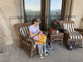
while touring the house, i stopped to work on it whenever the opportunity arose, like when we were on the grand and glorious loggia (back porch) that looks out over the estate and blue ridge mountains in the distance.


i did get a funny look from an estate employee patrolling this part of the house, but no one bothered me while i stitched here. i wasn't the only guest lounging there and making use of the chairs, but i was the only one stitching. i suppose i looked harmless enough with my quilt and tiny needle.

i would stitch every bit of handwork i've ever done on this loggia if i could. it was the ideal place for such pastimes. the chair was comfy, the weather and lighting perfect, the view unsurpassed. 


later on, i did some more binding while sitting creekside on the property as the other two worked on their novel reading.


i was really close to being done here, but someone had to go to the bathroom, so we moved closer in to the facilities.


i knew which part of the lower gardens i wanted to complete the binding in, but someone was using my bench. i had to wait for the interlopers to leave, then i plopped myself down in some shade to finish my binding while the other two visited the necessary. this is a shot of the last stitch going in with the location in focus rather than the stitch. because of the lighting exposure, you can't see all the pretty pink and purple flowers around me. but they are there.


done at last!

the girls caught up with me once marmee had taken some flower photos. she always loved to do that. the week after we returned from this trip mom found out her cancer was back. this was the last trip i got to take with her. i'm really grateful to have all the fun shots of her which show her quirks and personality that i got while we were there.

before i let loose the deluge of finish and detail shots, i want to record the inspiration for the palette and name of this quilt. i was already working on a series of giant sawtooth star quilts in various color palettes when i decided to make one for each of my children. this one was inspired by this delightful liberty and flowers quilt (free pattern at the end of this post) by suzy quilts:


suzy kindly enabled me by identifying the delicious benartex floral on the back, which i knew would be perfect for my own little suzy, d3's nickname when she was a baby (it's a derivative of her middle name). because of the inspiration source and the recipient's nickname, as well as the star pattern, the quilt became "radiant suzy"


this here is one of the main reasons i quilt - quilts are love made tangible, they are permanent hugs i can give my children to wrap around themselves whenever needed.


the backing - a combination of carlonia gingham in grey, a benartex floral, the luna moth print from heather ross's sleeping porch line, and a memoire a paris 2017 lawn from lecien fabrics.


the quilting was done in an aurifil 12wt thread in a soft, silvery grey.


during our visit, the biltmore had a chihuli glass exhibition going on, with installments all over the gardens. i happen to be a big chihuli fan, so this was an added bonus to our trip. once i had the quilt completed, i photographed it with some of the art. the rest of this post is those photos interspersed with detail shots of the quilt.

i'll admit, it was a warmish afternoon and i was not at the top of my game with styling the quilt and setting up the shots. i was hauling my 5 lb. dslr camera around for two day specifically so i could take good photos of the quilt, but d3 confiscated it and filled the card up with a bajillion photos of the tours we took, so all i had to work with was my iphone. as it was, at this point, i just wanted to throw the quilt around and shoot quickly anyway. the perfectionist side of me was in hibernation. and that's perfectly fine with me. good enough is/was good enough.


some of my stella grande quilts have used up to 8 colors randomly mixed throughout the star shape. this one uses four: three solids and a very subtle print, two kona cotton solid light purples, a solid grey, and the grey gingham. (i want to say at least one purple is called "petunia," but i'm not certain.) the four colors are arranged to make radiating rhomboid shapes that form the star.


someone else was a little tired of quilt photos and posing.


thanks to the wide printed selvage on the lecien floral print, i was able to do one of my favorite backing treatments and include the selvage in the backing.


the binding was the lighter of the two kona cotton solid purples.


here's a good look at the border treatment variation i chose: i made two-toned triangles by alternating the purples and grey gingham, with one of the backing florals randomly thrown in instead of a greyy once on each end.


i used two shades of yellow for the background: kona cotton solids in butterscotch and ocher, i think.


this one's for you, suzy q!
i hope you enjoyed your literary birthday quilt marmee trip.
mama loves you.